Welcome to our August Best of the Month selection: a monthly round up of our favourite recent campaigns. We love to celebrate our clients who are making great transit creative, designed perfectly for the space, with bold colours and eye-catching imagery!
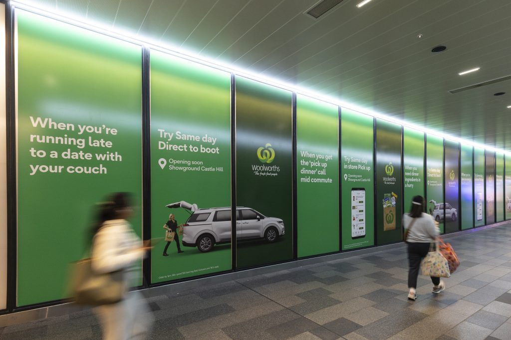
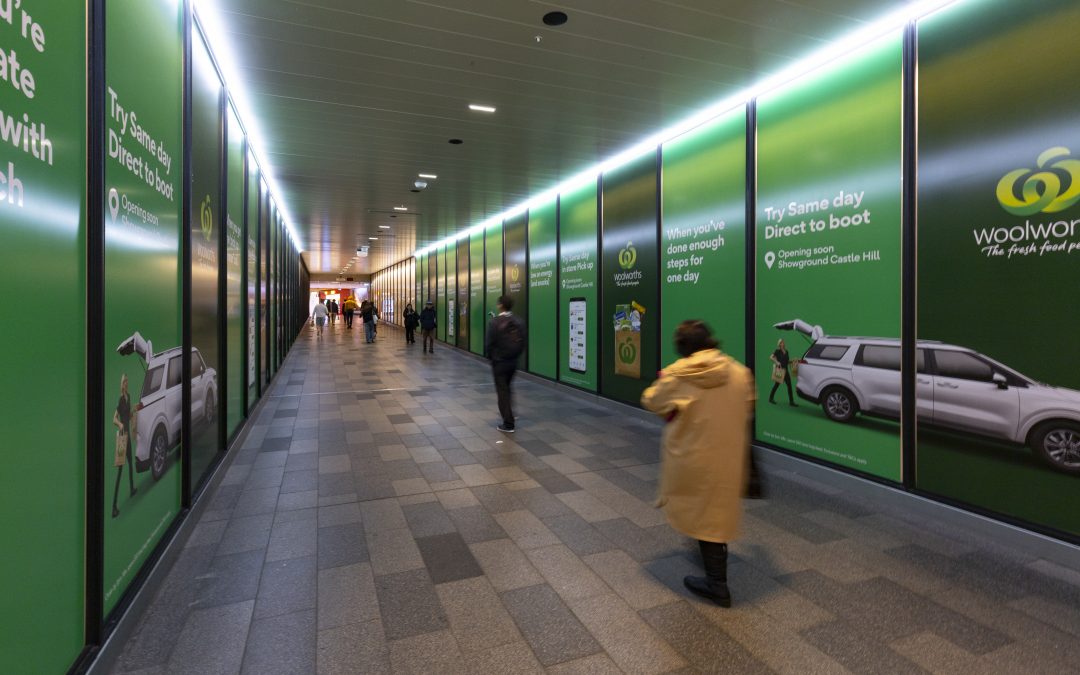
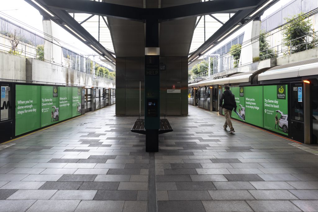
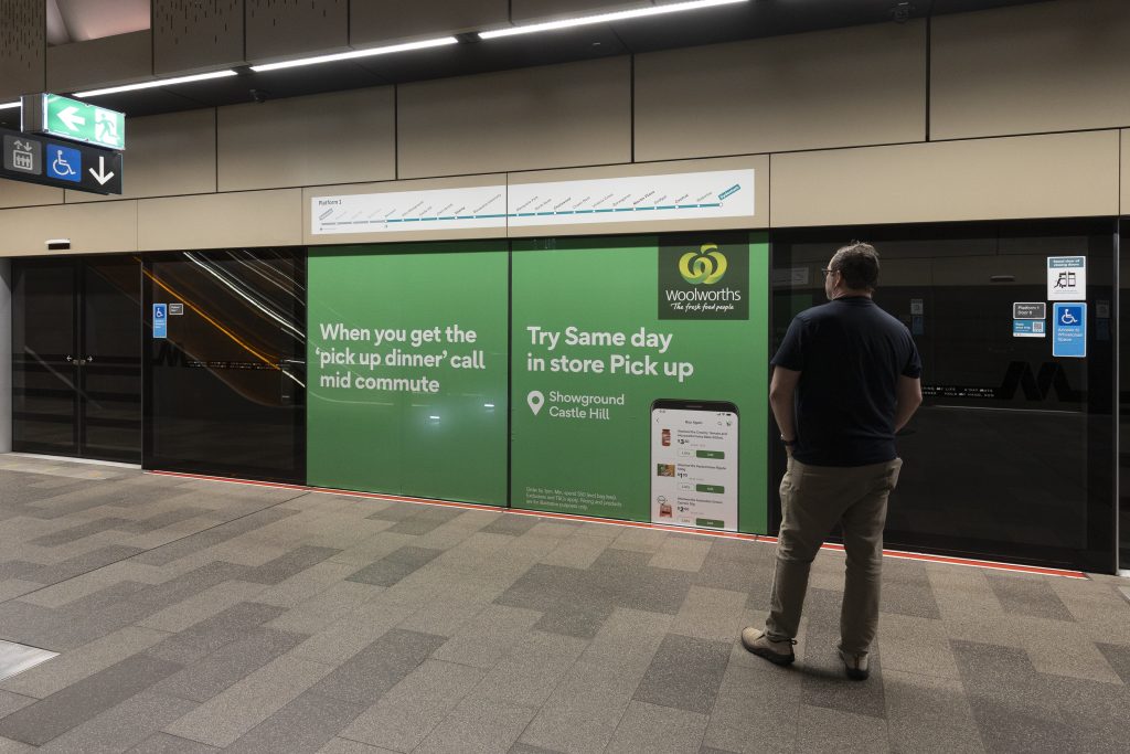
Woolworths
Format: Sydney Metro – Tunnel Wrap & Showcase
Woolworths has taken over multiple Sydney Metro Northwest stations to promote their newest store and Direct to Boot offerings. The impactful Tunnel Wrap, connecting Castle Towers Shopping Centre and Castle Hill Metro Station, captures commuter and shopper attention alike. Woolworths iconic green branding overlaid with a variety of shopping scenarios reminds consumers of their online shopping initiative, bringing groceries direct to your boot.
Why we love it: Purchasing multiple high-impact formats across four Sydney Metro stations allow Woolworths to dominate the daily commute amongst local shoppers!
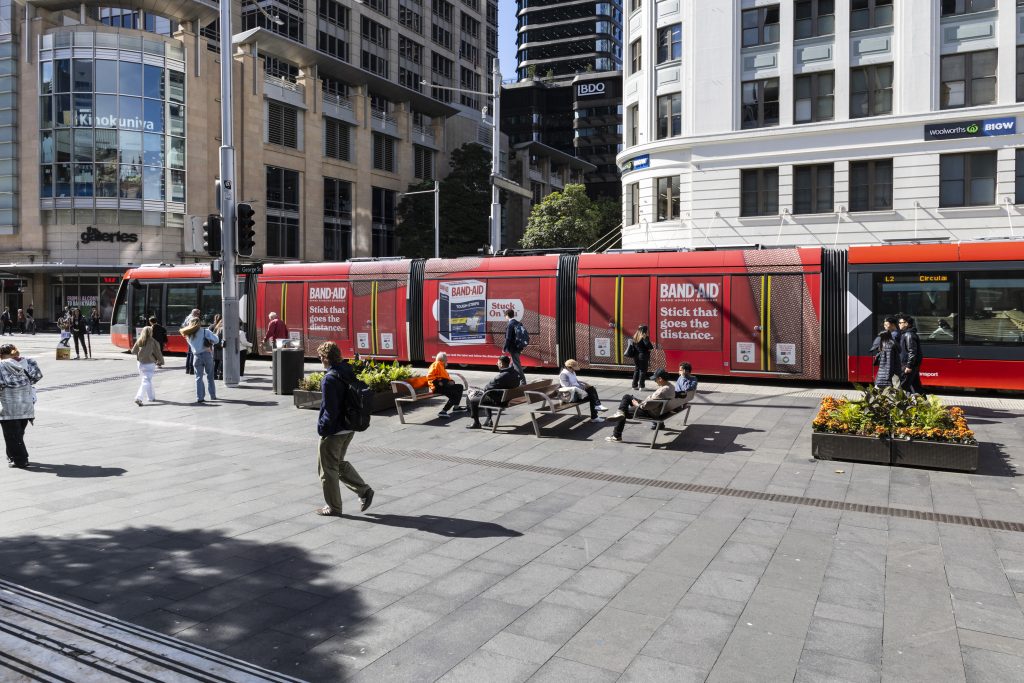
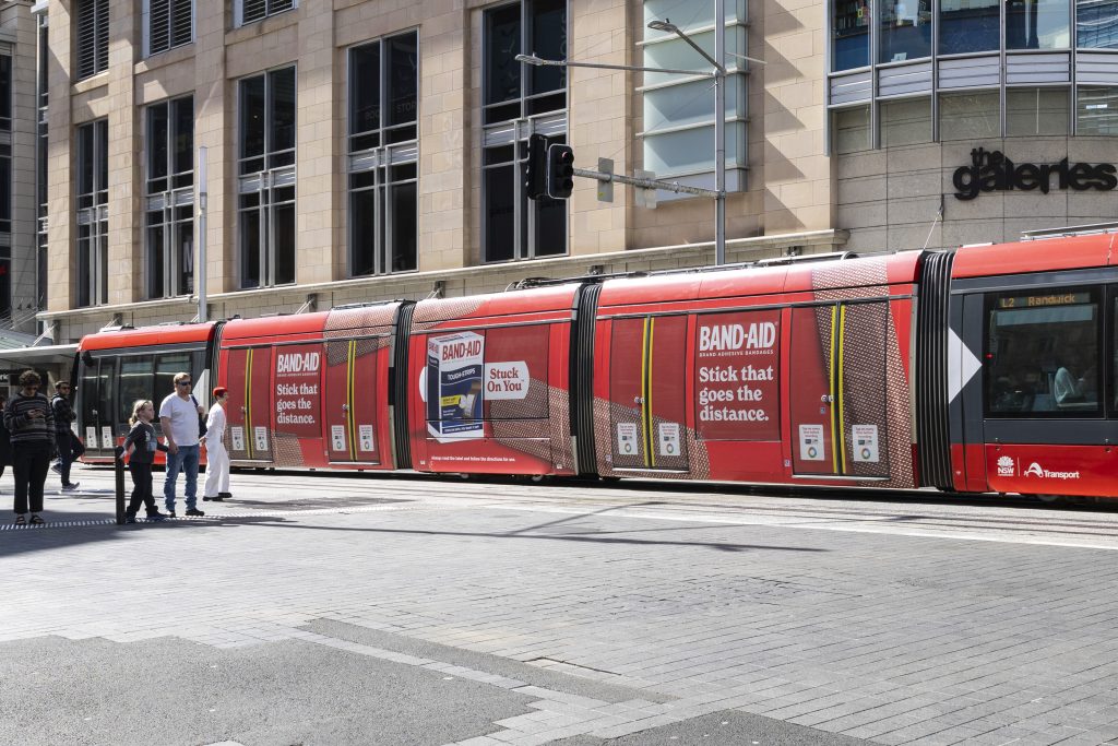
Kenvue – BandAid
Formats: Sydney Light Rail – Triple Carriage Wrap & Interior Portraits
Kenvue’s latest campaign for Band-Aid brings the product to life with a high-impact campaign on both the exterior and interior of the Sydney Light Rail. Aligning their campaign with the upcoming Sydney Marathon, Band-Aid is promoting its ‘stick that goes the distance’ – perfect for marathon competitors prior to and during the race. The simple branding with bold contrasting colours helps the campaign to stand out, especially in CBD environments.
Why we love it: The oversized Band-Aid visuals command attention for commuters in and around Sydney’s CBD, ensuring clear communication and cut through.
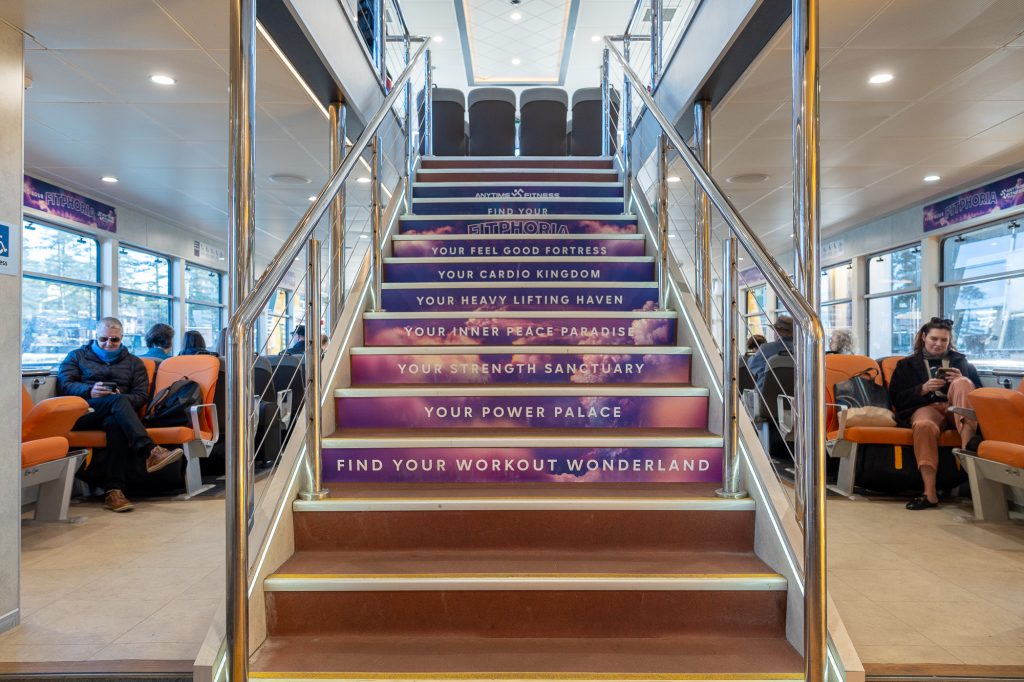
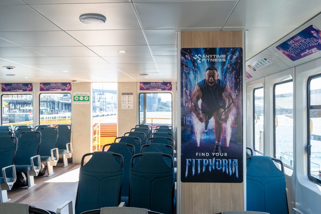
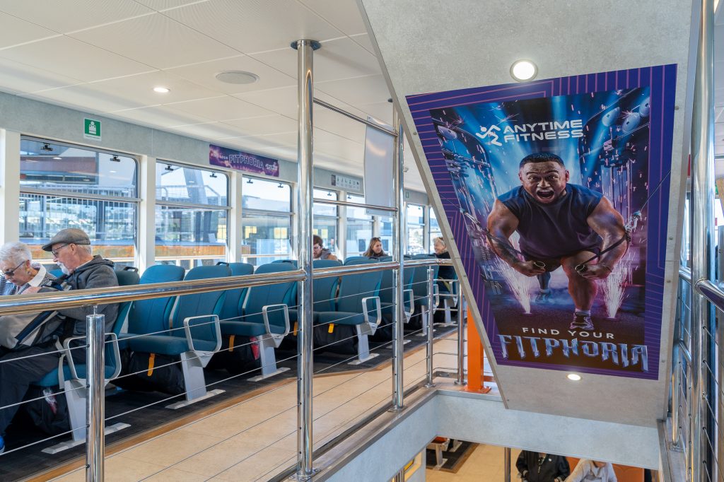
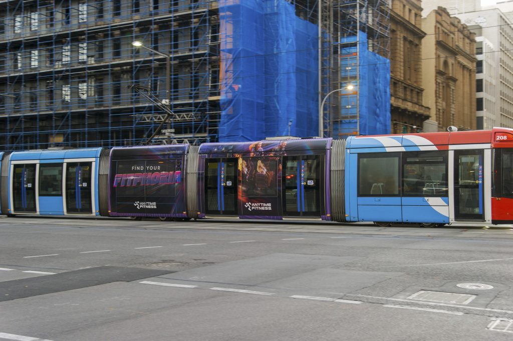
Anytime Fitness
Formats: Adelaide Trams – Megaside, Canberra Light Rail – Megaside & Sydney Ferries – Vessel Domination
Anytime Fitness has used a multi-market approach to engage with commuters in Adelaide, Canberra, and Sydney. The brand’s distinctive purple branding has been integrated into everyday environments, targeting commuters with high-visibility formats to increase consideration.
Why we love it: The ‘Find your Fitphoria’ campaign is a striking way to encourage brand engagement amongst commuters with a wide range of fitness goals. We especially love the Vessel Dominations on Sydney Ferries, which are effective in transforming practical spaces into visual formats as part of the colourful campaign.
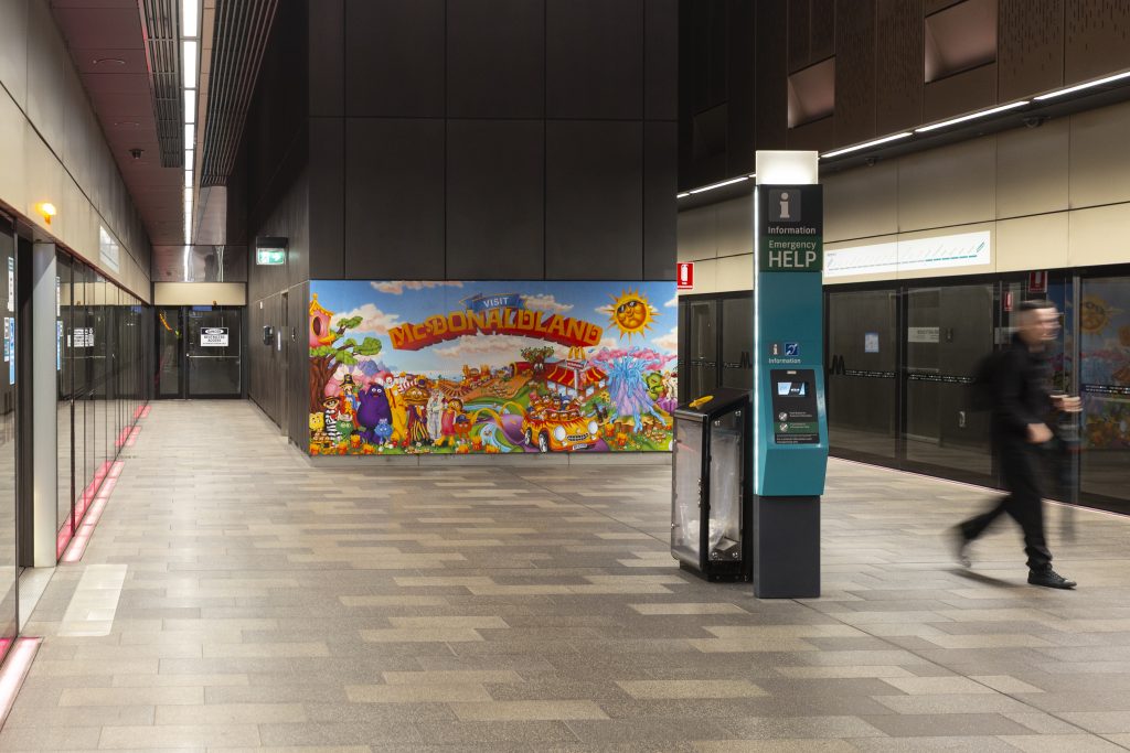
McDonald’s – McDonaldland
Formats: Sydney Metro – Showcase & Media Wall, Sydney Light Rail – Triple Carriage Wrap & Interior Domination
McDonald’s most recent campaign showcases vibrant and eye-catching colours, featuring bold branding that has a strong visual impact across the Sydney Metro and Sydney Light Rail networks. Leveraging high traffic environments, McDonald’s promotes its new McDonaldland meal to existing and potential customers. The use of the classic McDonald’s characters increases brand recognition by engaging with commuters in a playful way.
Why we love it: Embracing nostalgia, McDonald’s brings back its classic characters in a visually striking, joyful campaign that brightens up Metro and Light Rail stations and vehicles throughout Sydney.
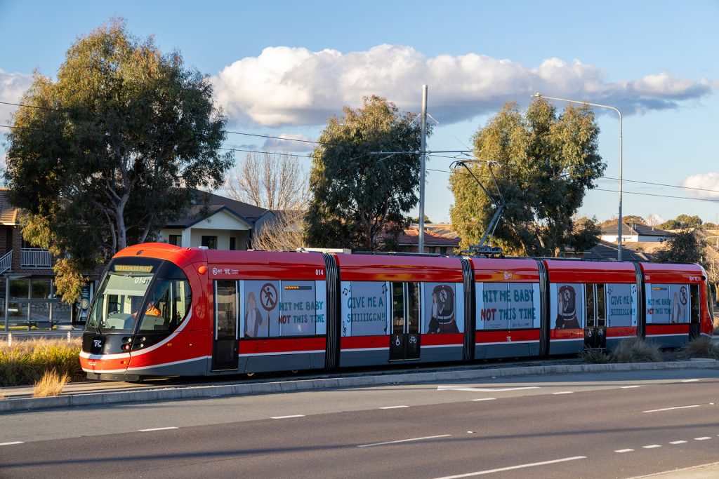
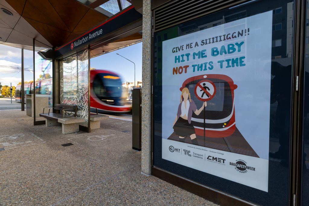
Rail Safety Week
Formats: Canberra Light Rail – Window Wrap and Station Portrait
TrackSAFE Foundation’s annual Rail Safety Week initiative highlights the importance of driver, pedestrian and commuter safety around rail corridors. The creative for the Canberra Rail Safety Week campaign came from a design competition for local Canberra design students. With 40 entries from students at local colleges, 4 winning designs became the official campaign artwork, with all entrants getting the chance to be featured on Light Rail Interior Posters.
Why we love it: Student involvement allows the message of Canberra Rail Safety Week to be spread amongst the community and encourages students to be more aware when riding the Light Rail.
Check out more of these great campaigns below and on our socials!

Recent Comments