Welcome to our October Best of the Month selection: a monthly round up of our favourite recent campaigns. We love to celebrate our clients who are making great transit creative, designed perfectly for the space, with bold colours and eye-catching imagery!
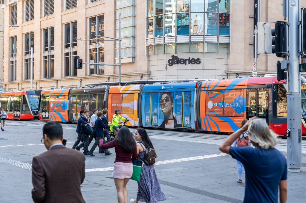
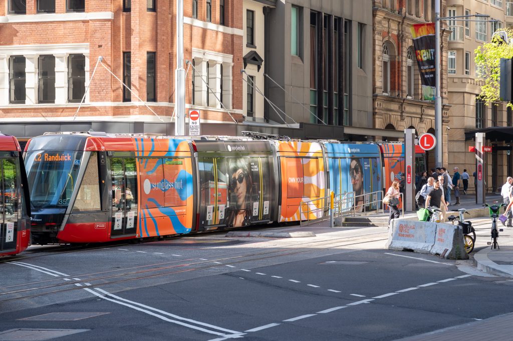
Sunglass Hut
Formats: Sydney Light Rail – Full Wrap
Sunglass Hut is bringing the summer vibes to the Sydney Light Rail with a vibrant and colourful Full Wrap, encouraging Sydneysiders to own their moment this sunny season. The campaign has been perfectly executed across the Light Rail with each panel alternating between bright summer prints and aspirational product shots. Sunglass Hut’s bold creative approach creates a true standout in the Sydney CBD.
Why we love it: The contrast between day and night highlights the product’s versatility, and the colourful summer artwork attracts attention, combining to form a strong, eye-catching creative execution.
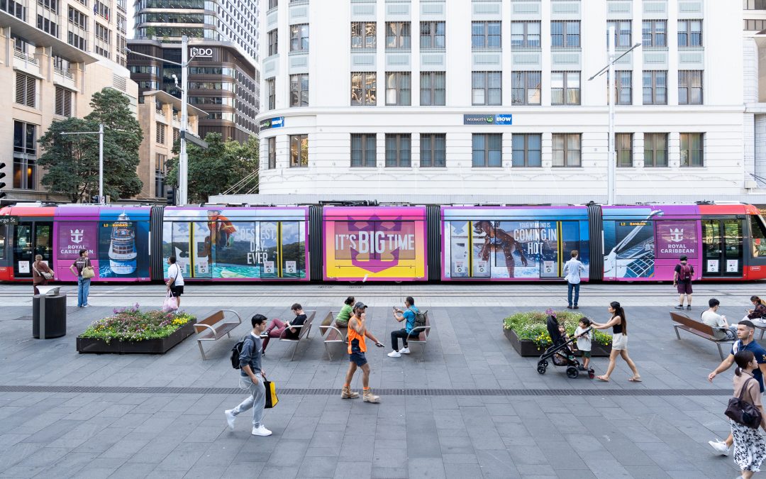
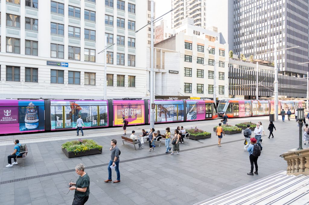
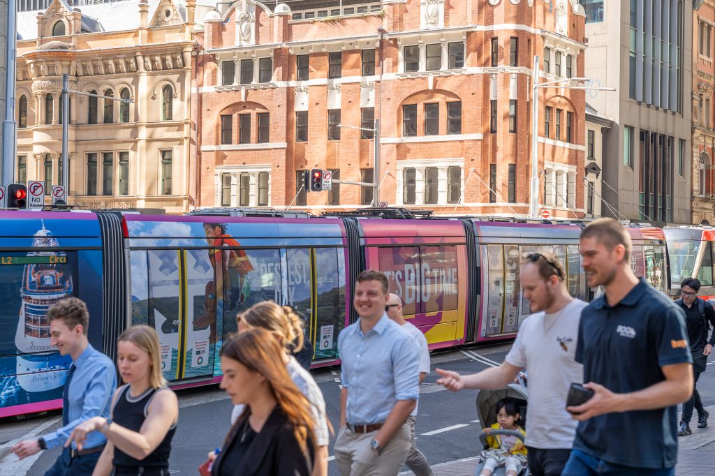
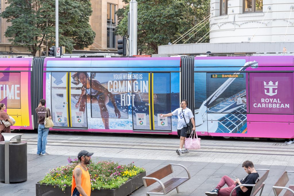
Royal Caribbean Cruises
Format: Sydney Light Rail – MegaTram
Royal Caribbean is making a powerful impression on the Sydney Light Rail with a MegaTram, reaching commuters throughout the CBD on the city’s largest moving billboard. The vibrant, eye-catching creative is designed to capture the attention of both commuters and surrounding foot traffic and encourages consideration amongst those planning their next holiday.
Why we love it: This campaign imagery is a great visual representation of what Royal Caribbean has to offer on board and encourages commuters to book their next cruise adventure.
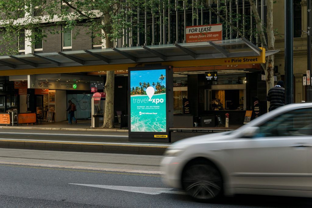
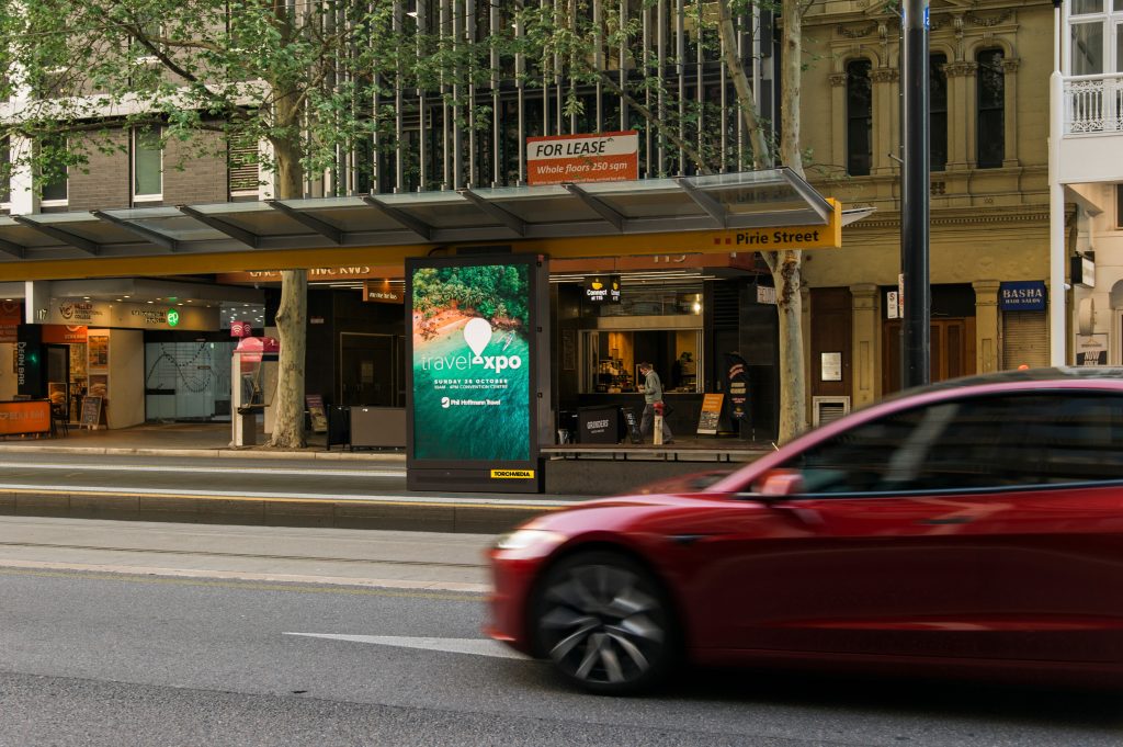
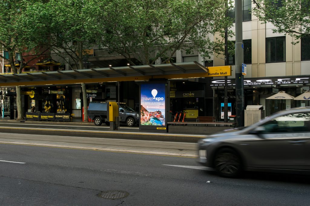
Phil Hoffmann Travel
Formats: Adelaide Trams – Digital Portraits
Phil Hoffmann Travel Expo is transporting Adelaide Tram commuters to their dream holiday destination during their daily journey. Phil Hoffmann Travel effectively utilised the flexibility available via Digital OOH, scheduling various creatives to speak to a wider range of potential travellers.
Why we love it: By using multiple creative designs, the various locations attract further attention and brighten up the space, getting commuters daydreaming of their next dream holiday destination.
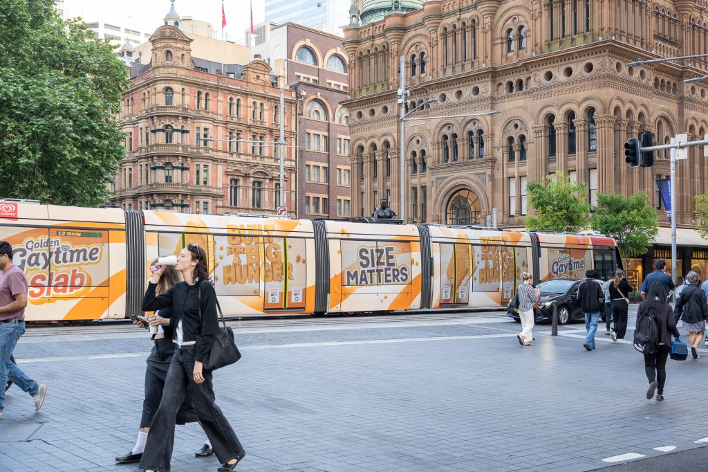
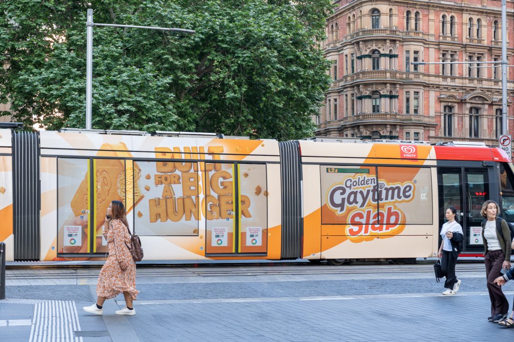
Golden Gaytime Slab
Formats: Sydney Light Rail – Full Wrap
Golden Gaytime is turning heads with a Full Wrap on the Sydney Light Rail – launching its new supersized Golden Gaytime Slab. Perfectly timed ahead of summer, the supersized text makes the branding and promotion easy to read and jumps out to commuters throughout the Sydney CBD. The playful execution encourages Sydneysiders to get amongst the new ice-cream, combining flowing visuals and clever copy.
Why we love it: Playing on “Size Matters”, this Sydney Light Rail Full Wrap makes a big impact for an ice-cream built for a big hunger.
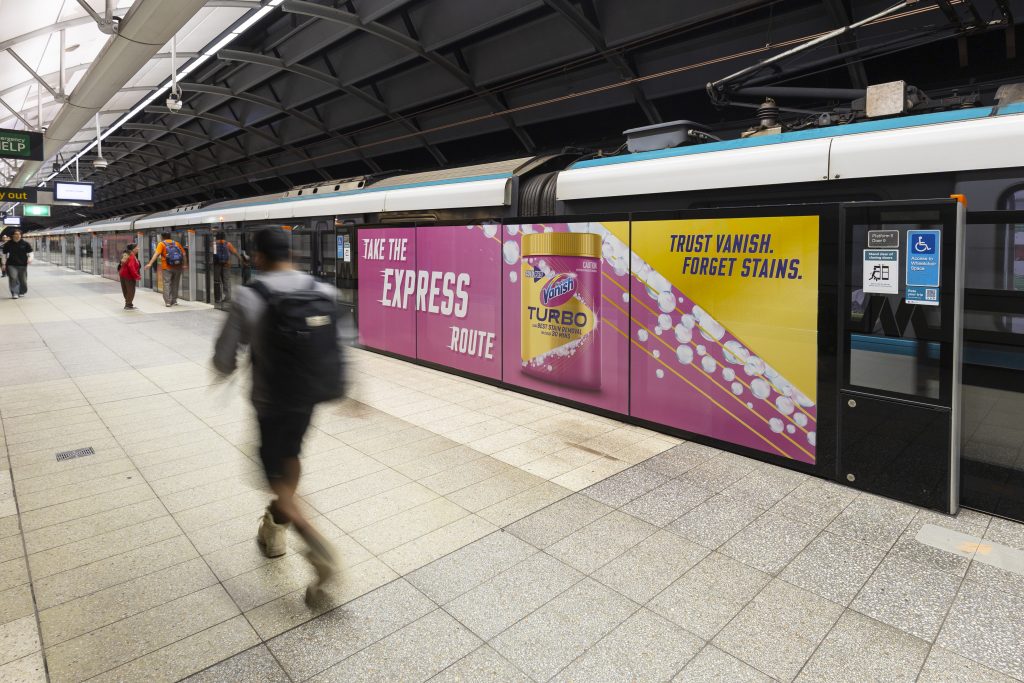
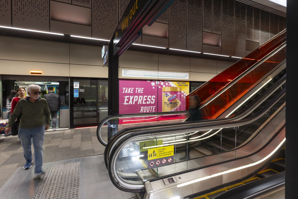
Vanish Turbo
Formats: Sydney Metro – Showcase, Melbourne Trains – Trackview, Brisbane Trains – Trackview
Take the express route on the Sydney Metro and find the vibrant pink Vanish Turbo campaign on showcases throughout Metro stations. Extending the campaign on Melbourne and Brisbane Trains, Vanish Turbo positions itself as a quick and powerful solution for stain removal in high traffic commuter environments.
Why we love it: With a simple message that aligns perfectly to the commute, the colourful, eye-catching creative allows for increased product recall for commuters on their daily journey.
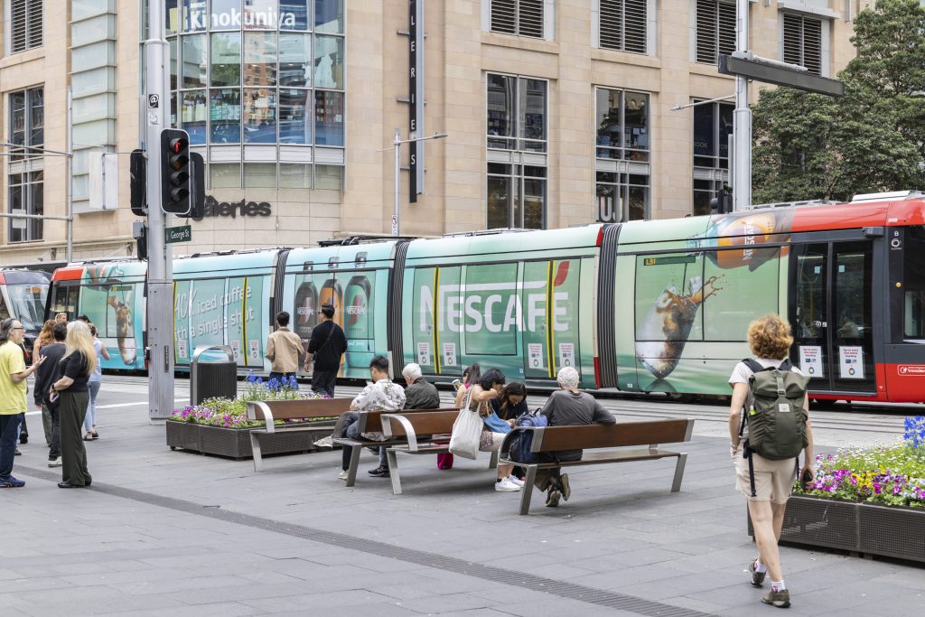
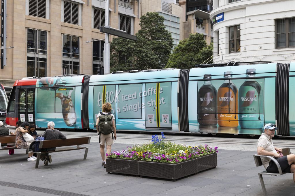
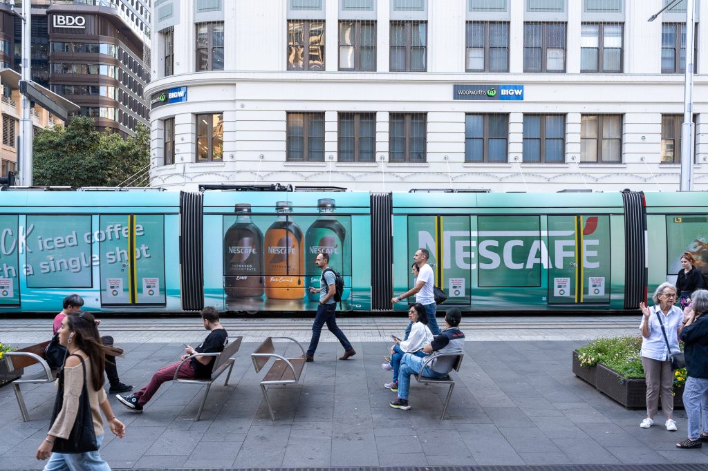
Nescafé
Formats: Sydney Light Rail – MegaTram
Nescafé’s new Cold Brew Concentrates are making a bold statement across Sydney by taking over the Light Rail with a striking aqua-themed MegaTram. This high-impact format captures the attention of daily commuters, enhancing brand visibility and awareness for the new iced coffee range. Timed strategically in the lead-up to summer, the campaign aims to position Nescafé Concentrates as the go-to refreshment for the warmer months.
Why we love it: The contrast between the blue-greens and rich coffee tones creates a visually striking design that enhances Nescafé’s brand presence in Sydney.
Check out more of these great campaigns below and on our socials!
Recent Comments