Welcome to our January Best of the Month selection: a monthly round up of our favourite recent campaigns. We love to celebrate our clients who are making great transit creative, designed perfectly for the space, with bold colours and eye-catching imagery!
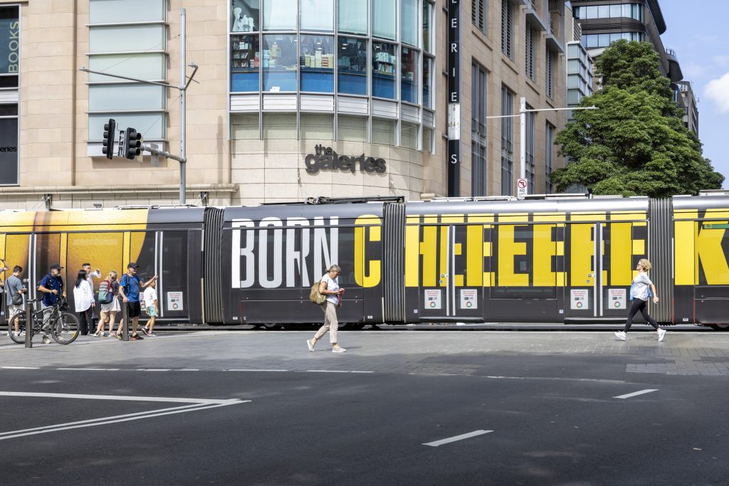
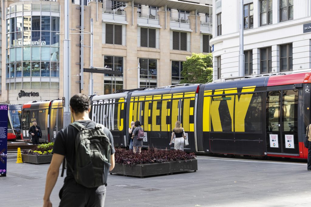
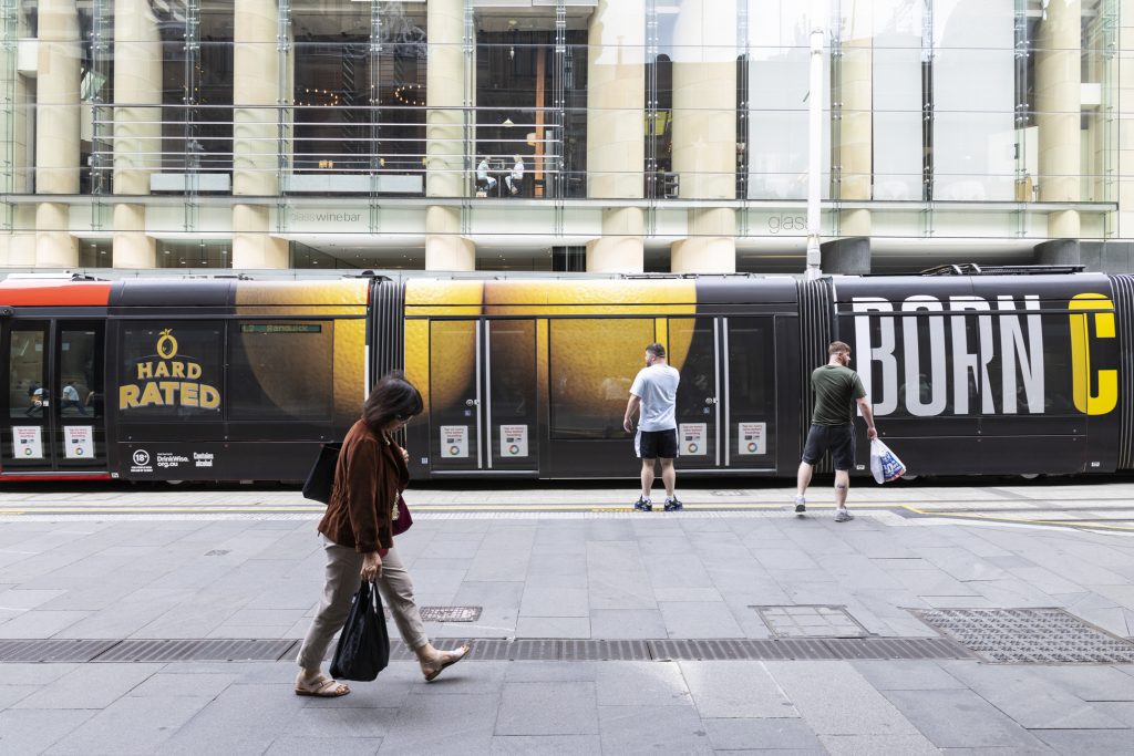
Hard Rated
Formats: Sydney Light Rail – Full Wrap
Hard Rated is getting “Cheeky” with its latest Sydney Light Rail campaign, delivering a bold Full Wrap. Featuring over-sized text with their black and yellow branding, the striking creative grabs commuter attention, driving strong impact and boosting both product and brand recall.
Why we love it: The creative plays on the word “cheeky”, using lemons to resemble a visual that delivers humour to the streets of Sydney.
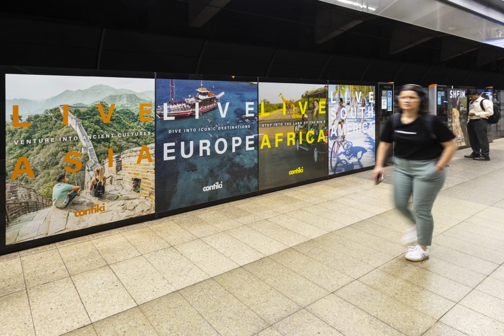
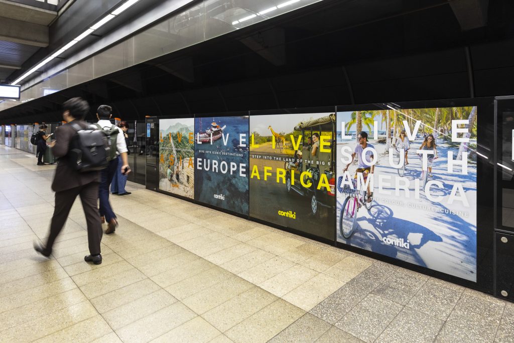
Contiki
Format: Sydney Metro – Showcases
Contiki is inspiring Sydney Metro commuters to experience colour, culture, and cuisine, on their next holiday adventure. Contiki’s “Live” campaign is showcasing vibrant destinations and bringing iconic landmarks to life across Metro stations, transporting commuters to their next holiday destination.
Why we love it: Contiki has made full use of the space, displaying a variety of creatives to make their campaign more attention-grabbing for commuters on the go, encouraging them to book their next holiday.
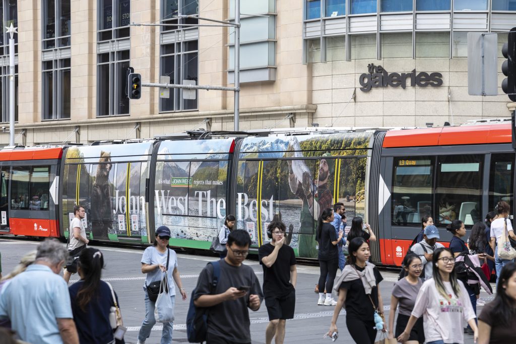
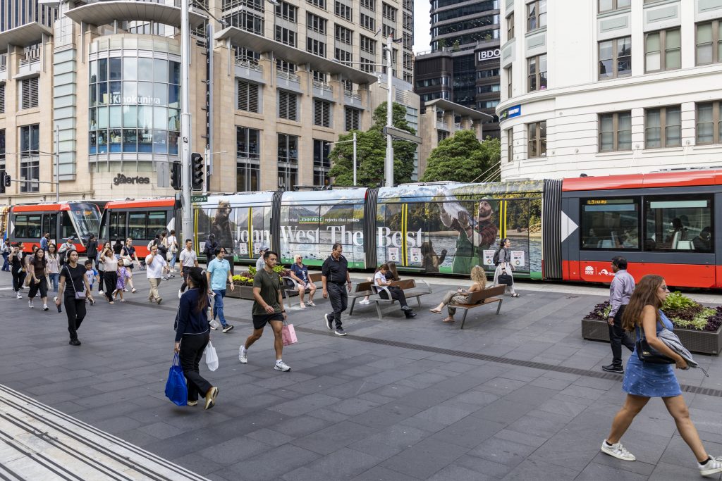
John West
Formats: Sydney Light Rail – Triple Carriage Wrap
John West is transporting commuters to the great outdoors with its latest ‘John West The Best’ campaign. The brand’s distinctive identity is aligned with scenic imagery over a Triple Carriage Wrap, showcasing the pristine landscapes where only the freshest fish are sourced in the cleanest environments. The campaign reinforces the idea that it’s what John West rejects that makes the product the best, leaving out anything that doesn’t meet their standards.
Why we love it: The panoramic imagery of mountains and lakes transforms the light rail and commuters into a calm, immersive outdoor environment that stands out for its visual impact.
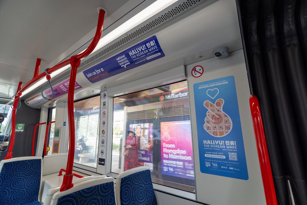
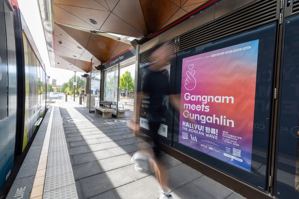
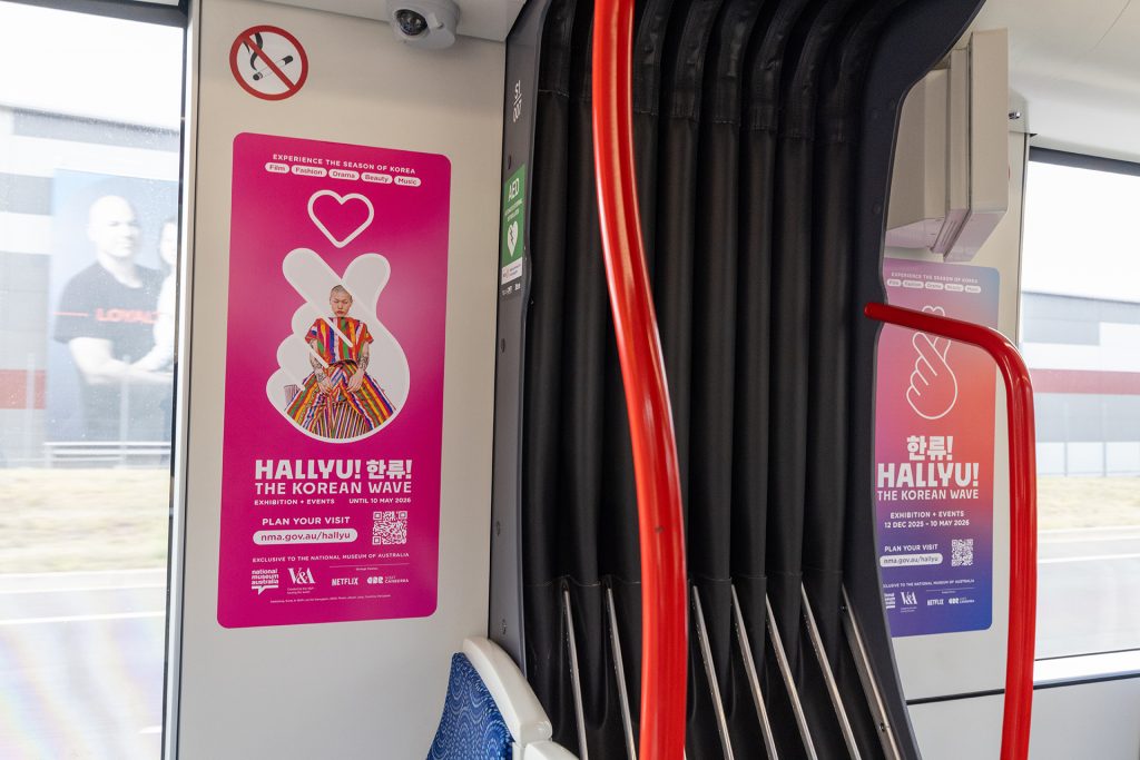
National Museum Australia
Formats: Canberra Light Rail – Station Portrait & Interior Takeover
The National Museum of Australia’s ‘Hallyu!’ exhibition is taking over the Canberra Light Rail, celebrating South Korean music, fashion and beauty as one of the most dynamic cultural movements of our time. The campaign uses vibrant colours to capture attention at Station Stops and continues the experience on-board with Interior Landscapes and Portraits.
Why we love it: The combination of striking Station Portraits and the on-board Interior Takeover keeps the exhibition front of mind, seamlessly engaging commuters as they move from the platform to the vehicle throughout their Canberra Light Rail journey.
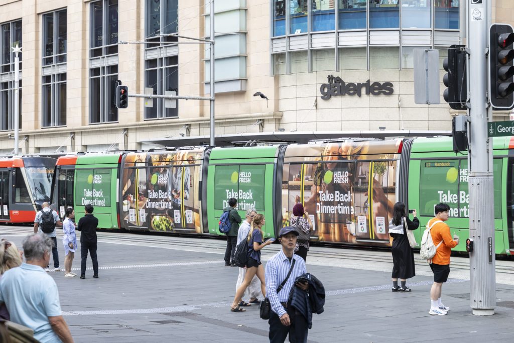
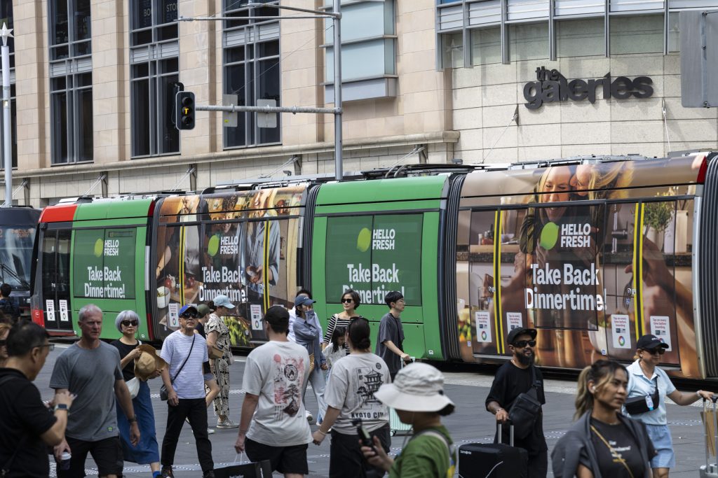
Hello Fresh
Formats: Sydney Light Rail – Full Wrap
Hello Fresh has transformed the Sydney Light Rail into a moving kitchen throughout the Sydney CBD, using bold green branding and food imagery to capture appetites and imagination. The campaign’s “Take Back Dinertime” message relates to commuters on the go, thinking about what’s for dinner on their way home from work.
Why we love it: Hello Fresh has taken advantage of the space the Full Wrap format has to offer using consistent green branding and high-impact graphics to ensure the message is easy to absorb, and highly relevant to busy commuters on the go.
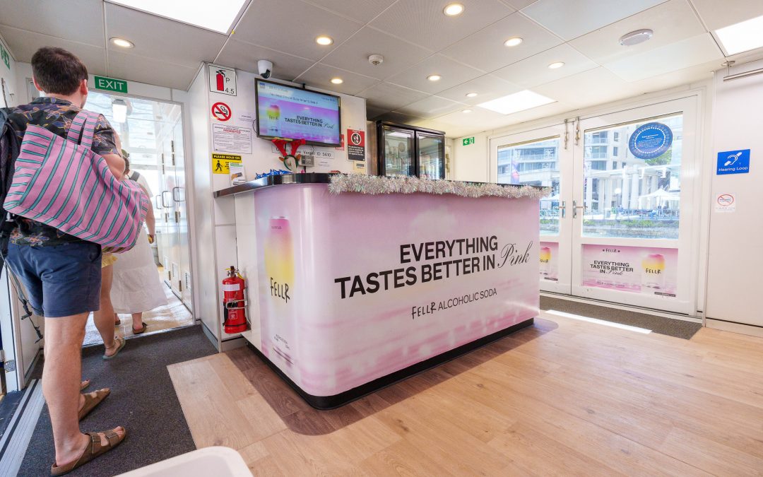
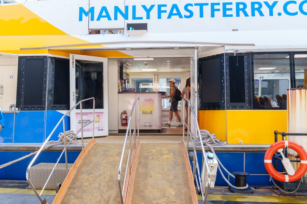
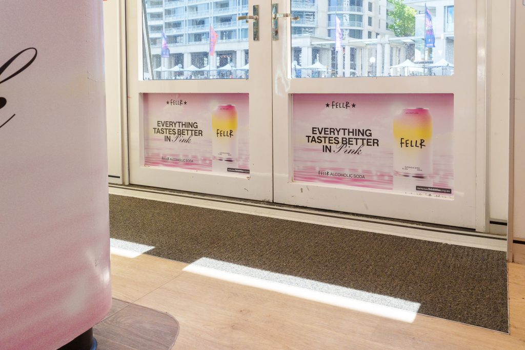
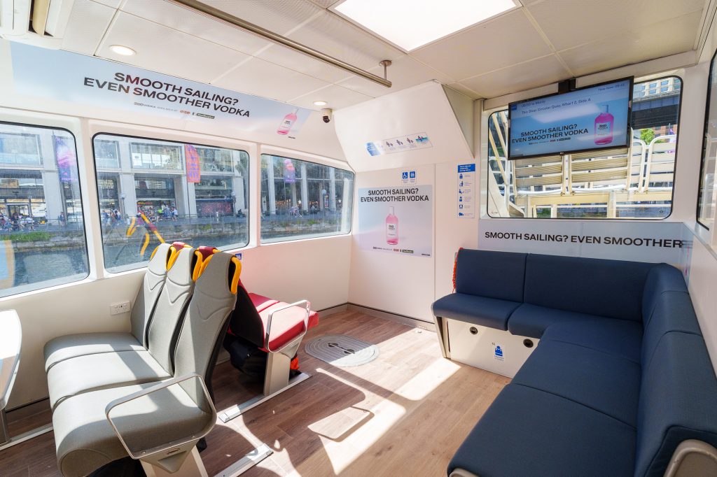
Fellr
Formats: My Fast Ferry – Digital Network & Vessel Domination
Fellr is painting the ferries pink with their latest campaign showcasing its new Watermelon Vodka and Pink Lemonade flavours. The campaign fully utilises the My Fast Ferry, dominating key advertising placements to connect with commuters in a relaxed, summertime setting, where they can also enjoy a Fellr from the onboard bar!
Why we love it: Fellr cleverly uses the phrase “smooth sailing” as a play on words, linking the smoothness of their vodka with the ferry journey to create a contextually relevant message that resonates with commuters.
Check out more of these great campaigns below and on our socials!
Recent Comments