Welcome to our June Best of the Month selection: a monthly round up of our favourite recent campaigns. We love to celebrate our clients who are making great transit creative, designed perfectly for the space, with bold colours and eye-catching imagery!
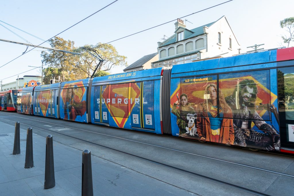
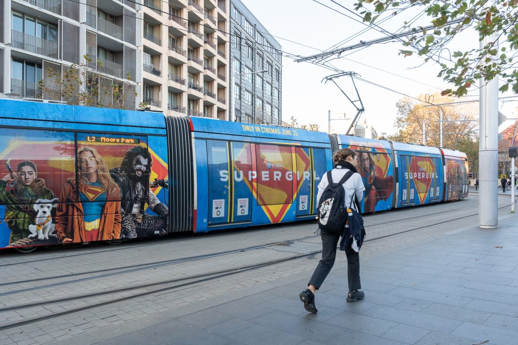
Warner Bros Supergirl
Format: Sydney Light Rail – Full Wrap
Warner Bros Supergirl brings high impact action to Sydney Light Rail with a striking Full Wrap featuring its iconic colour palette and logo. The larger-than-life creative generates excitement and action, as though Supergirl is breaking through the vehicle itself, building hype for the film among Sydneysiders.
Why we love it: The Warner Bros Supergirl campaign uses an iconic yet simple creative approach, delivering bold standout impact while creating a sense of nostalgia for audiences across Sydney’s CBD.
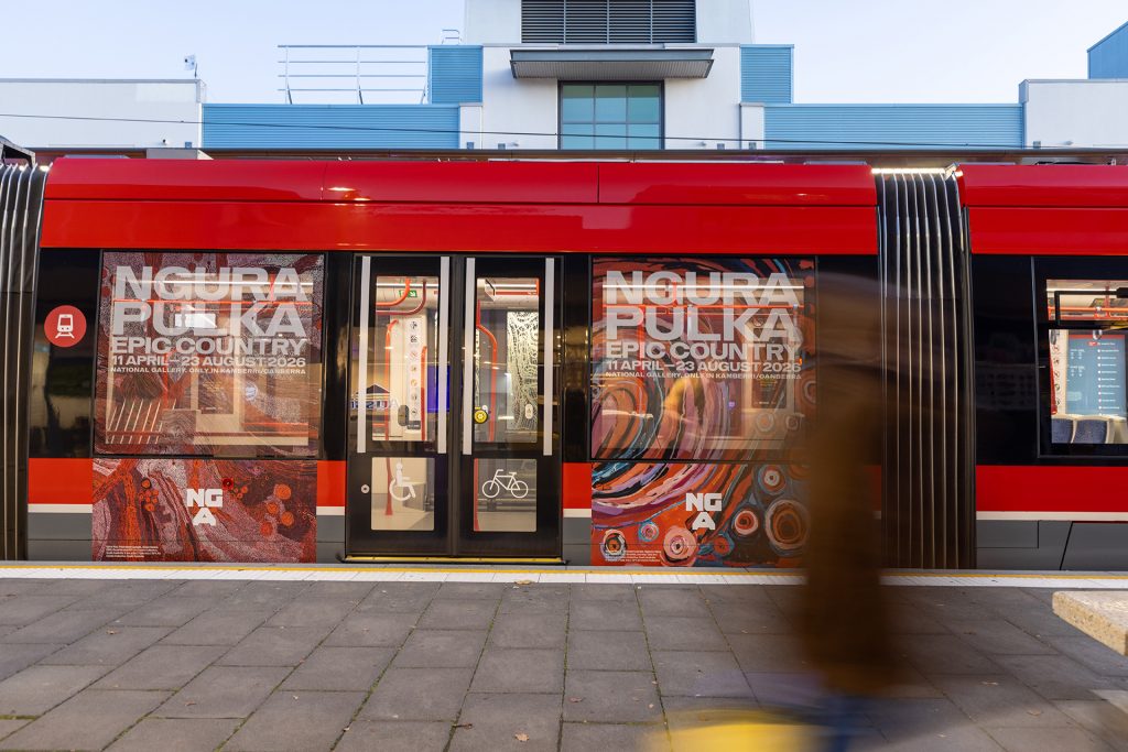
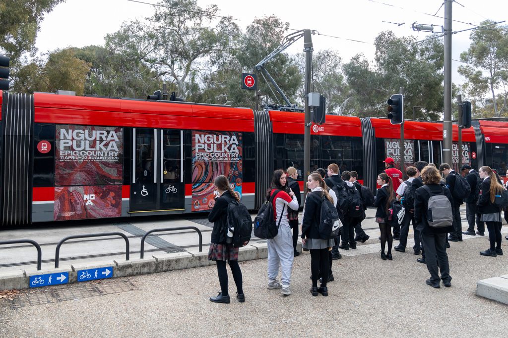
NGA
Formats: Canberra Light Rail – Portraits
National Gallery of Australia are showcasing their latest exhibition, Ngura Pulka – Epic Country, across visually striking Portraits on the Canberra Light Rail. The campaign celebrates major works by leading First Nations artists, bringing powerful stories of country and connection to life, and reflecting the rich histories, landscapes, and cultural traditions that have shaped Australia.
Why we love it: The vibrant campaign encourages commuters to engage with significant works by First Nations artists, providing a powerful platform to showcase the exhibition while celebrating the talent, creativity, and cultural contributions of the featured artists and collectives.
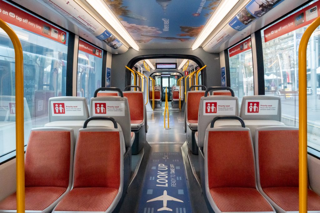
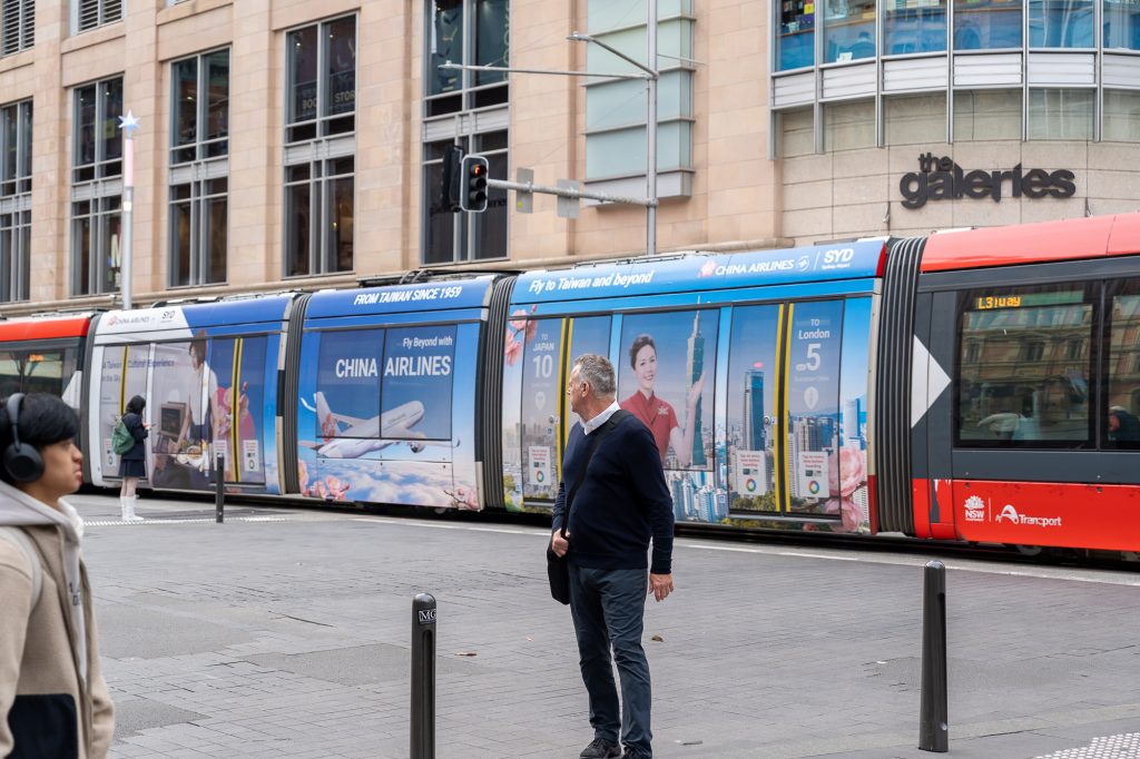
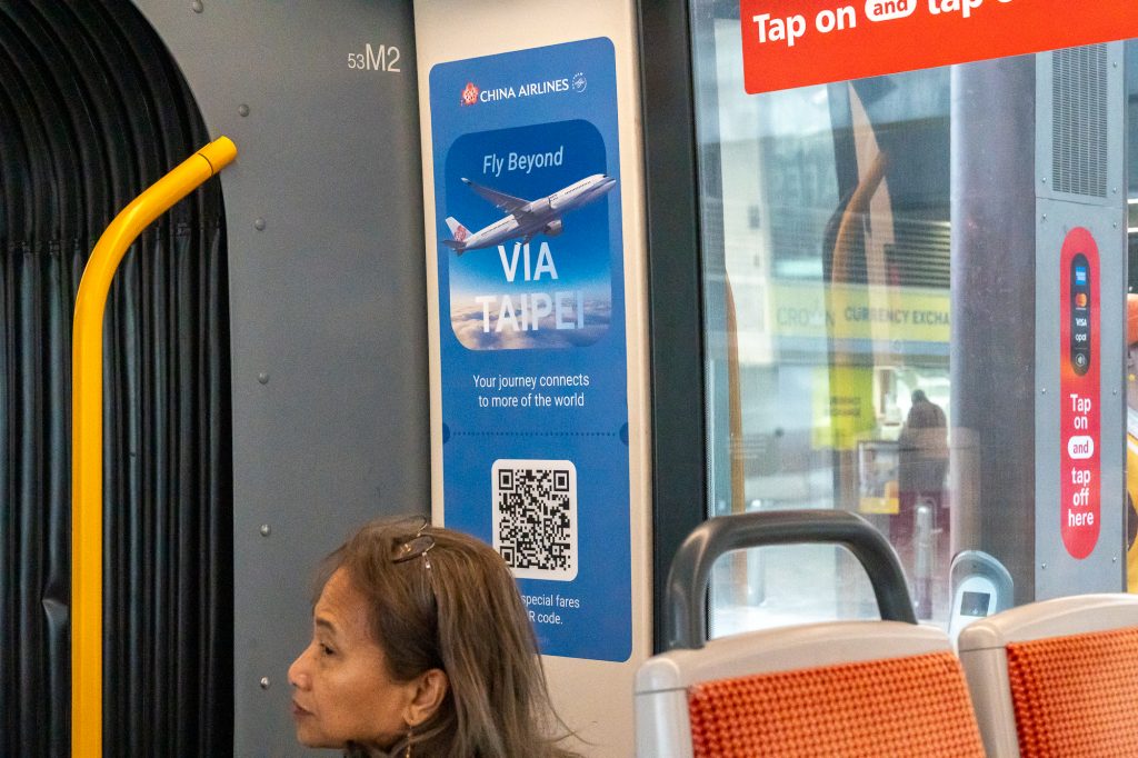
China Airlines
Format: Sydney Light Rail – Triple Carriage Wrap & Interior Domination
China Airlines is making an impact on Sydney Light Rail with a striking Triple Carriage Wrap paired with an immersive Interior Domination. The captivating creative showcases the destinations and experiences China Airlines has to offer, inspiring commuters at every touchpoint. Inside the tram, the Interior Domination extends brand presence throughout the vehicle, with messaging and imagery reminiscent of a boarding pass with QR codes linking to special fares, along with prompts to “Look up” and visualise their next journey through the skies. This eye-catching execution surrounds passengers with the China Airlines brand, delivering prolonged engagement in a high dwell environment.
Why we love it: Paired together, the two formats create a seamless brand experience that transports commuters into the world of travel from the moment they see the vehicle, through to their journey onboard.
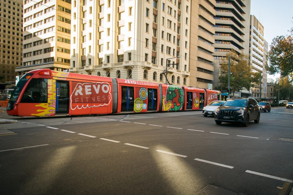
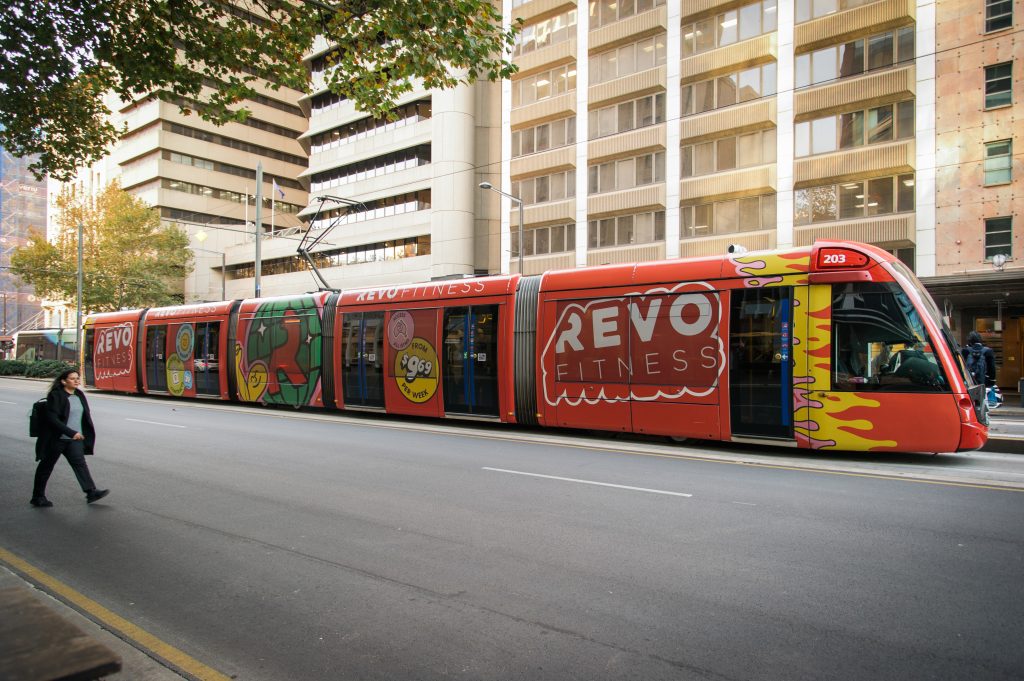
Revo Fitness
Format: Adelaide Trams – Full Wrap
Revo Fitness is energising the Adelaide Tram network with a striking Full Wrap featuring oversized graphics, bold text, and vibrant branding. The high impact creative transforms the vehicle and commands attention from commuters and surrounding traffic. As the tram travels throughout the city, the campaign creates a powerful brand presence, driving awareness and keeping Revo top of mind for Adelaideans looking to start or elevate their fitness journey.
Why we love it: The disco ball and fun flame graphics at the front of the tram add a sense of energy to the static campaign and reinforce Revo Fitness’ bold and motivating brand personality.
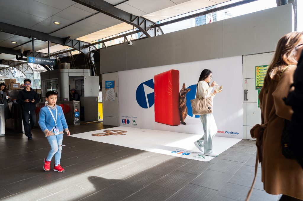
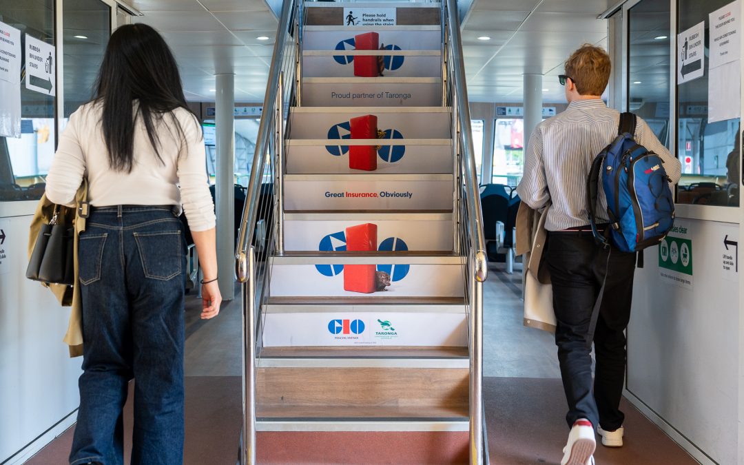
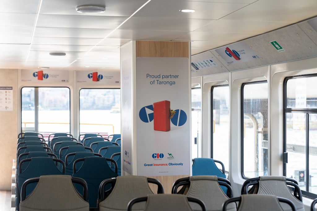
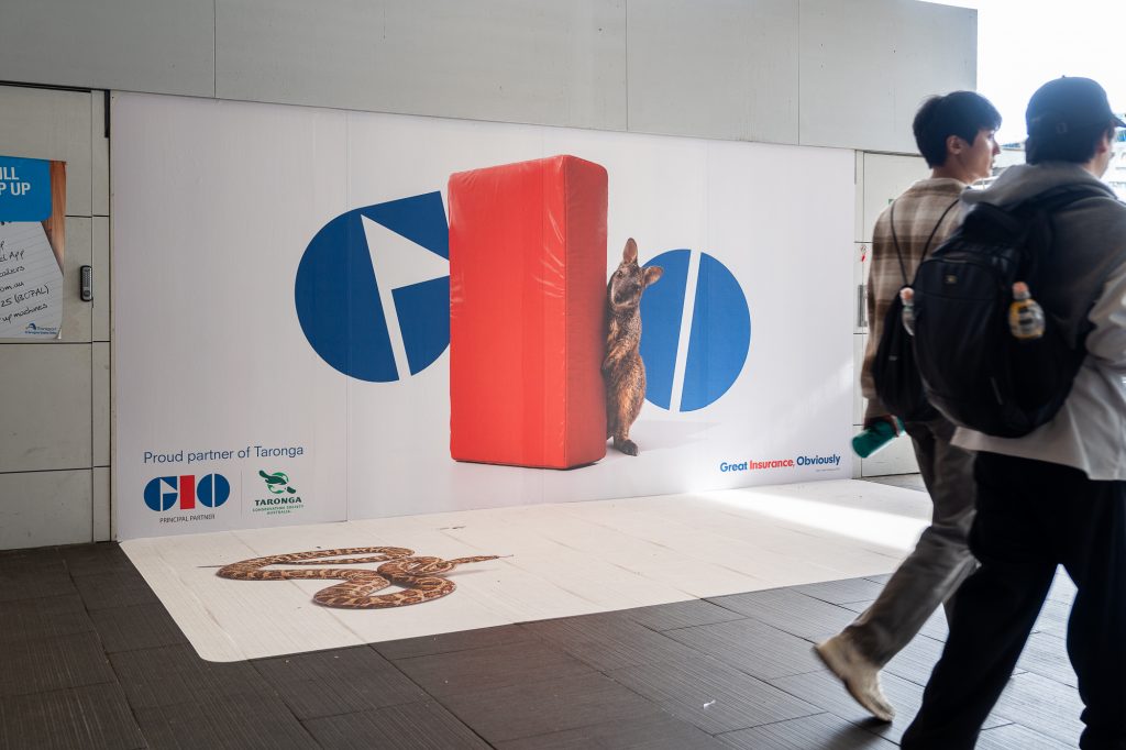
GIO x Taronga Zoo
Formats: Sydney Ferries – Vessel Domination, Wharf Wall & Floor Media
GIO has partnered with the iconic Taronga Zoo, giving their “Great Insurance, Obviously” brand platform an Aussie wildlife focused spin through a campaign across Sydney Ferries. GIO have used Wharf Wall and Floor Media at Circular Quay alongside a Vessel Domination, engaging commuters travelling to and from the Zoo. The campaign artwork incorporates 3D effects that bring the animals to life with the Wharf Wall and Floor immersing audiences within the creative.
Why we love it: Wharf formats and Vessel Dominations are a great pairing as audiences make their way from the wharf onto the ferry, keeping the brand top of mind for commuters by dominating the space across their entire journey to the Zoo.
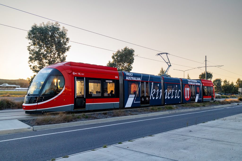
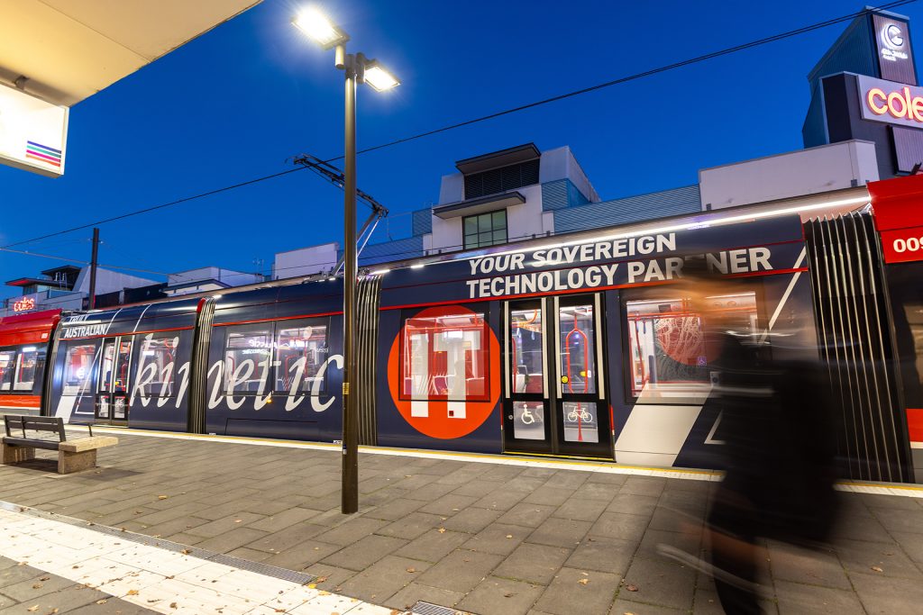
Kinetic IT
Format: Canberra Light Rail – Triple Carriage Wrap
Kinetic IT is a strong example of effective transit advertising, using bold, contrasting colours and oversized messaging to create a highly visible and impactful brand presence. The striking creative ensures the brand stands out in a transit environment, capturing attention and communicating its message clearly to audiences on the move. The large format execution maximises reach and impact, ensuring Kinetic IT remains front of mind throughout the journey.
Why we love it: Kinetic IT demonstrates a strong understanding of effective transit advertising, using a simple yet bold creative approach that maximises visibility and impact on a moving vehicle.
Check out more of these great campaigns below and on our socials!
Recent Comments