
Welcome to our October Best of the Month selection: a monthly round up of our favourite recent campaigns. We love to celebrate our clients who are making great transit creative, designed perfectly for the space, with bold colours and eye-catching imagery!
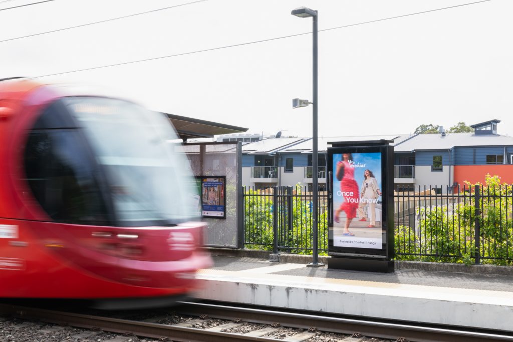
Archies Footwear
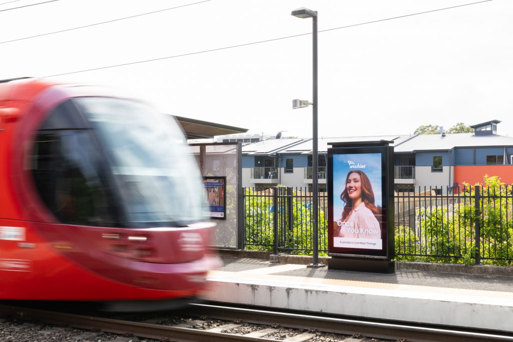
Format: Sydney Light Rail – Full Wrap & Interior Takeover, Inner West Light Rail – Digital Portraits
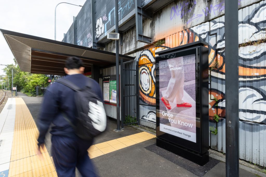
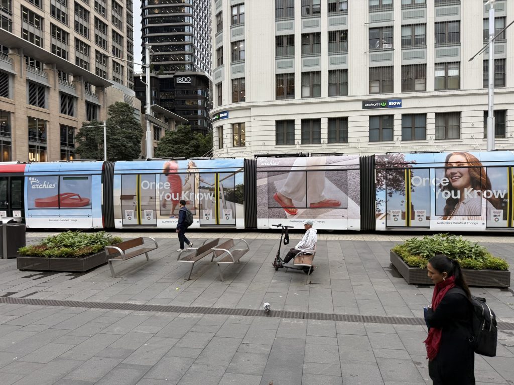
Australia’s comfiest thongs are making a statement on the Sydney Light Rail with a Full Wrap, Interior Takeover, and Digital Portraits along the Inner West line. Archies Footwear is making the most of the digital network by showcasing multiple creatives to keep commuters engaged while they wait for their tram. The Full Wrap brings the product to life with an oversized thong graphic, combining neutral tones with pops of red and blue to create a bold campaign that stands out on the move.
Why we love it: Featuring the tagline “Once You Know”, the campaign encourages consideration and trial, inviting audiences to discover the world of Archies Footwear just in time for summer.
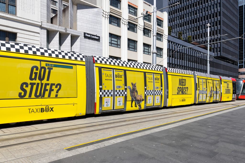
TaxiBox
Formats: Sydney Light Rail – Full Wrap
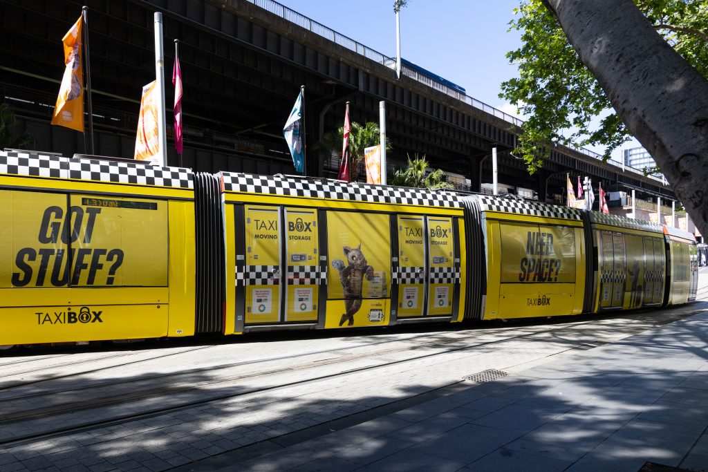
TaxiBox is making a statement on the Sydney Light Rail with a bold, eye-catching creative designed to turn heads as it travels through the CBD. Taking inspiration from the iconic yellow taxi cab, the playful execution combines the signature yellow with a black and white checkered pattern to create a standout look that leaves a lasting impression. Paired with bold text and simple messages, “Got stuff? Need space? Get TaxiBox”, the creative communicates the brands offering at a glance, making it perfect for transit media.
Why we love it: The vibrant yellow creative stands out in a busy CBD environment, capturing attention and making the brand hard to miss.
Up
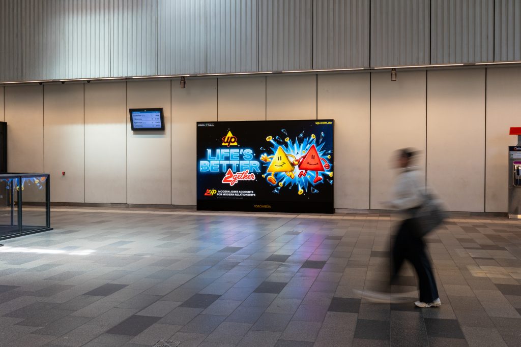
Format: Sydney Light Rail – Full Wrap & Sydney Metro – Digital Landscapes
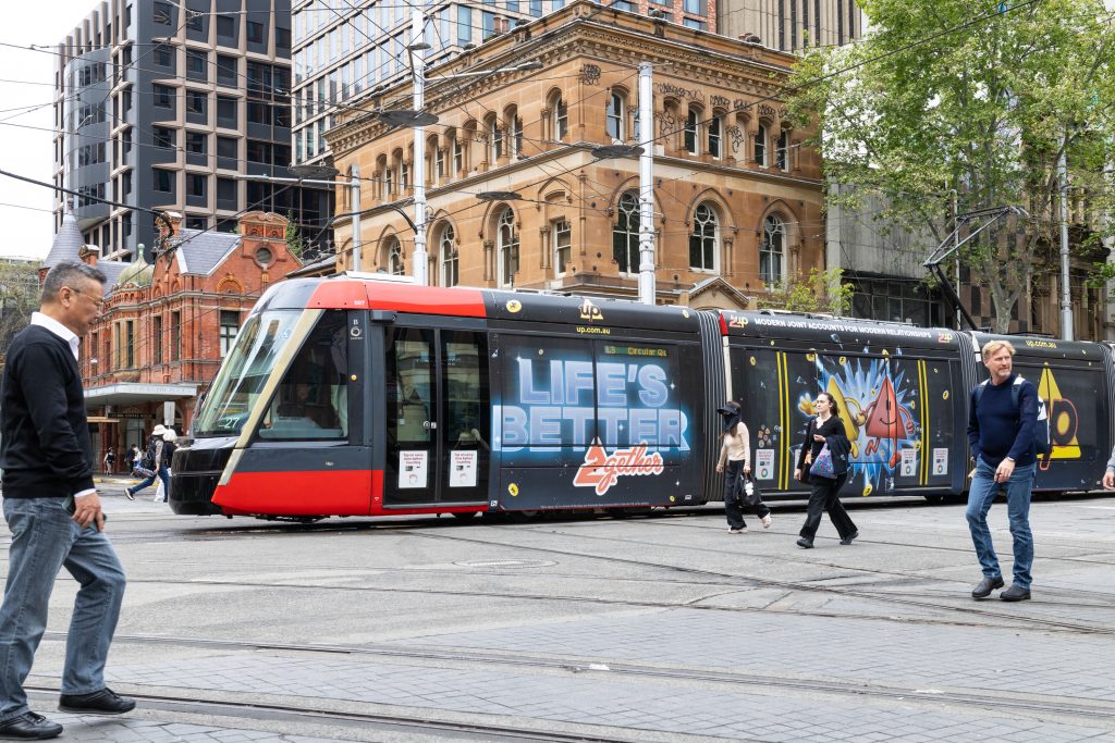
Up has brought a video game inspired creative to Sydney with a playful Full Wrap on the Sydney Light Rail and Digital Landscapes across the Sydney Metro network. The “Life’s Better 2gether” campaign promotes Up’s joint accounts, playing on the world of co-op gaming with its 2Up feature, letting customers add a Player 2 to their account. Featuring bold colours, playful shapes and minimal text, the creative offers a fun and engaging execution that is making an impact across our transit media.
Why we love it: Up transforms an everyday task like banking into a fun, video game-inspired campaign, using playful creative to bring the brand to life and connect with audiences across Sydney.
Poco Vino
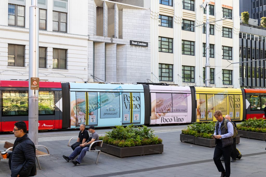
Format: Sydney Light Rail – Triple Carriage Wrap
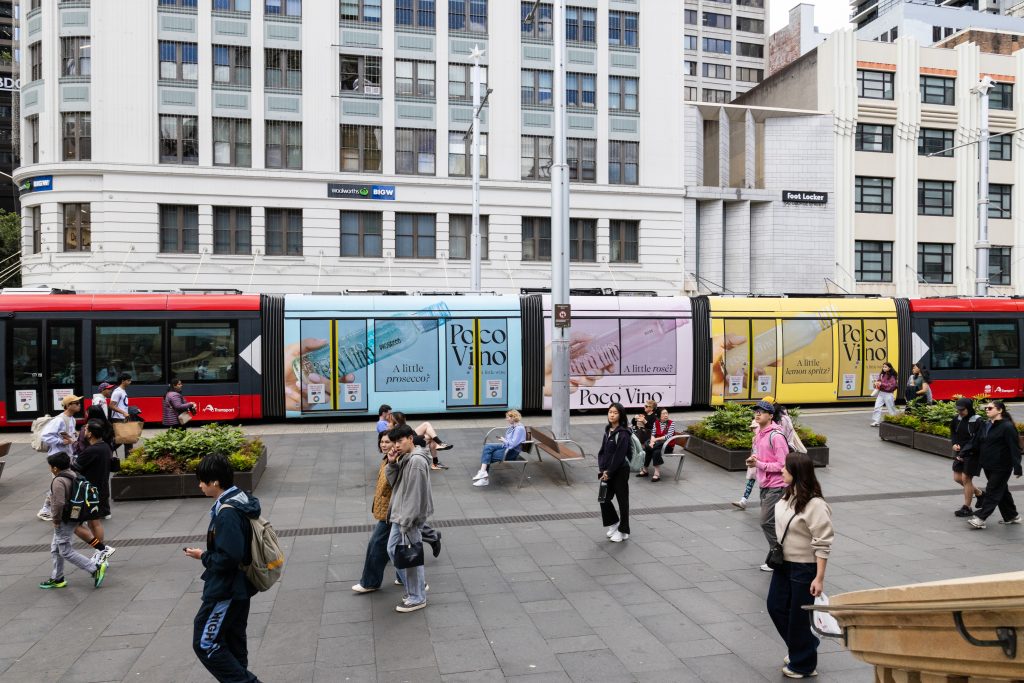
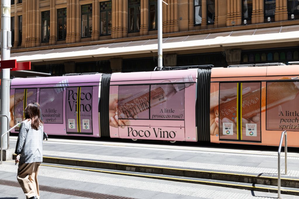
Poco Vino is bringing a splash of colour to the streets of Sydney with a vibrant Triple Carriage Wrap on the Sydney Light Rail. Making the most of the double-sided vehicle, the campaign features a different colour palette on each side and carriage of the vehicle, with pastel blues, pinks, yellows, purples and oranges creating a feel-good aesthetic that brings Poco Vino’s little wine range to life. Just in time for the summer season, the conversational messaging gets Sydneysiders thinking about their next refreshing drinks, asking the all-important questions like “A little passionfruit spritz?”
Why we love it: Poco Vino have taken full advantage of the space the Sydney Light Rail has to offer by using different creatives on either side of the vehicle to feature their broad product range, maximising visual impact and delivering a colourful, eye-catching campaign.
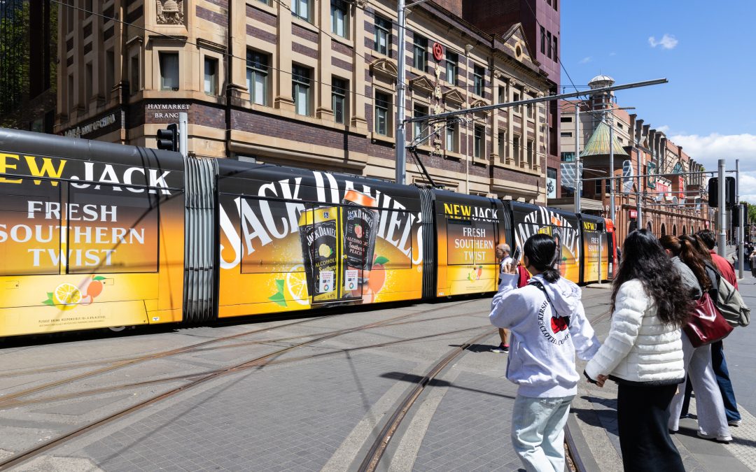
Jack Daniel’s
Formats: Sydney Light Rail – Full Wrap & Interior Domination
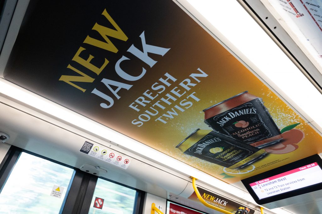
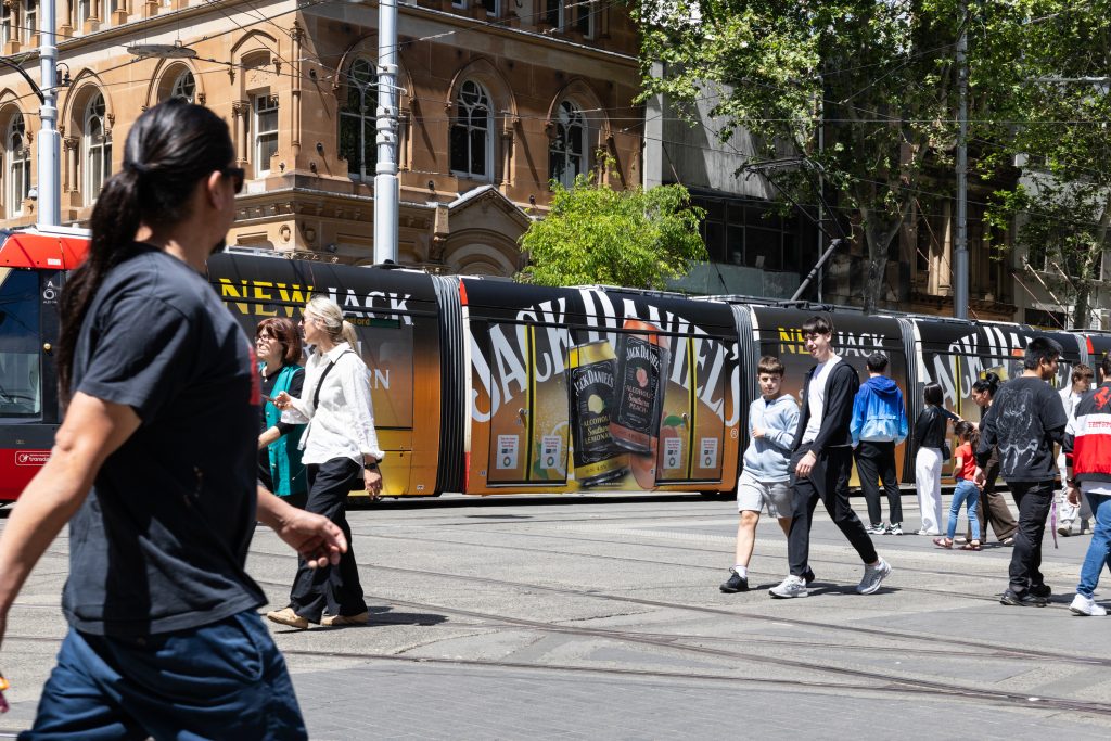
Jack Daniel’s is taking over Sydney’s CBD and Inner West with an impactful Full Wrap and Interior Domination on the Sydney Light Rail. Showcasing its new Southern range, the creative showcases a refreshing, citrus-inspired summer design paired with Jack Daniel’s iconic branding. The campaign continues inside the vehicle with an immersive Interior Domination across floors, ceilings and walls. Integrated QR codes encourage commuters to explore and shop the range online, creating an interactive opportunity for the audience to connect with the product.
Why we love it: The bold brand creative embodies the essence of summer, creating an immersive experience from the exterior to the interior of the vehicle that captures attention and maximises opportunities to engage commuters throughout their journey.
Check out more of these great campaigns below and on our socials!

Recent Comments