
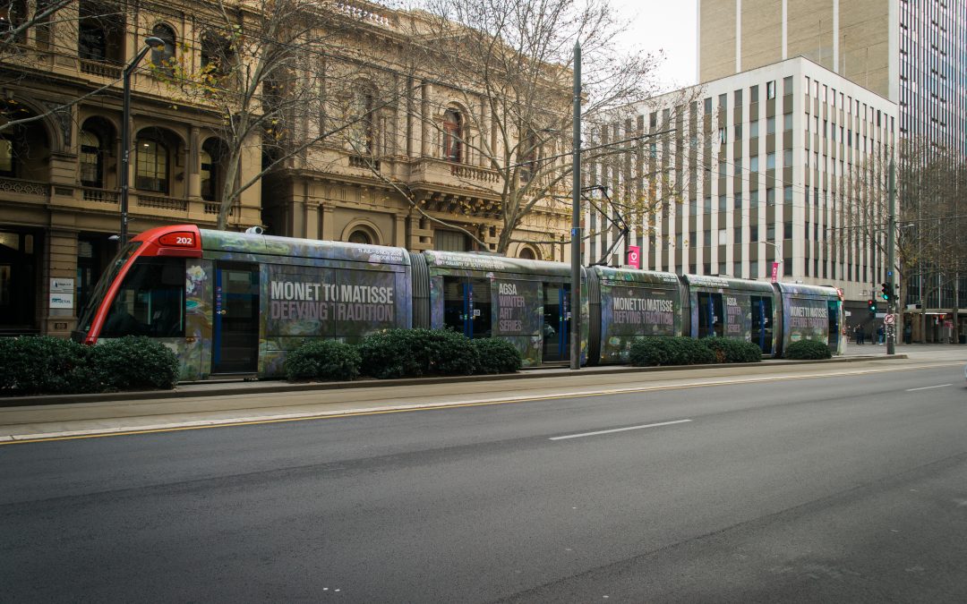
Welcome to our July Best of the Month selection: a monthly round up of our favourite recent campaigns. We love to celebrate our clients who are making great transit creative, designed perfectly for the space, with bold colours and eye-catching imagery!
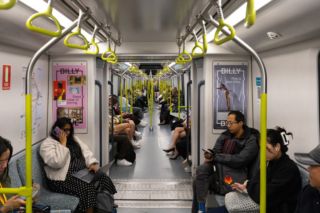
Billy Blue College
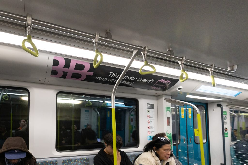
Format: Sydney Metro – Interior Takeover
Billy Blue College of Design has taken over the interior of Sydney Metro with Internal Portraits and Landscapes, creating an immersive showcase of creativity and design. The campaign demonstrates a dynamic mix of colour, shape, text and imagery, reflecting the creative skills and design expertise that students can develop at the college. The bold and visually engaging execution is perfectly suited to the transit environment, capturing commuters’ attention while demonstrating the possibilities of a career in design. Integrated QR codes provide a seamless call to action, allowing commuters to explore Billy Blue College of Design’s courses, discover more about what the college offers and take the next step towards enrolment.
Why we love it: The campaign features on-brand text for the transit environment, “for creatives going places” and “this service doesn’t stop at ordinary” making it a contextually relevant and engaging campaign for commuters on the busy Sydney Metro.
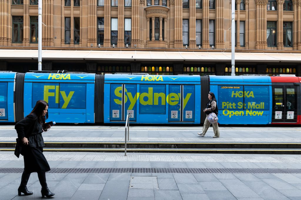
HOKA
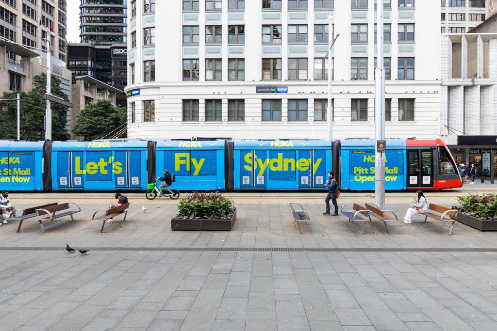
Formats: Sydney Light Rail – Full Wrap
HOKA is celebrating the opening of its new store with a high-impact Full Wrap campaign across the Sydney Light Rail. Featuring a bold yet minimal creative, the campaign uses vibrant, eye-catching colours to command attention and stand out within the busy CBD environment. HOKA is strategically reaching Sydneysiders in close proximity to its new store, building awareness and driving foot traffic to the Pitt Street Mall location.
Why we love it: HOKA is building excitement around its new store with bold “Let’s Fly Sydney” messaging, building anticipation and encouraging local audience engagement with the brand.
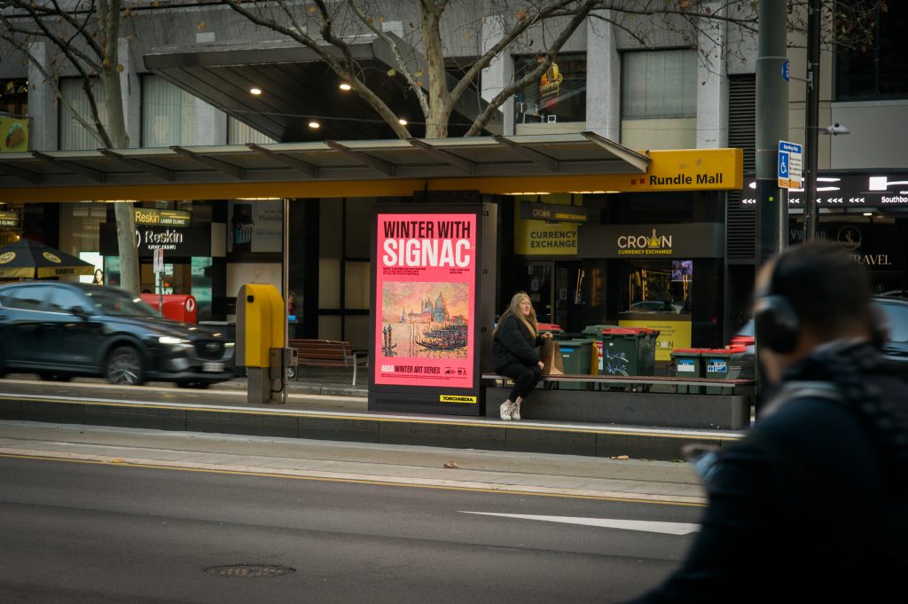
AGSA – Monet to Matisse
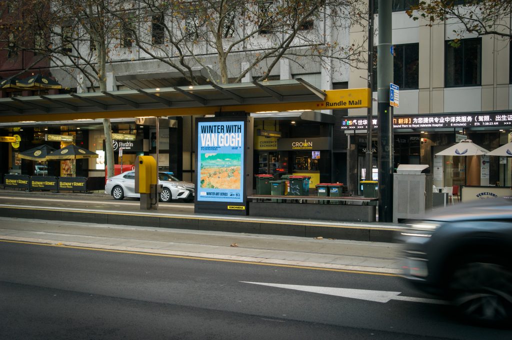
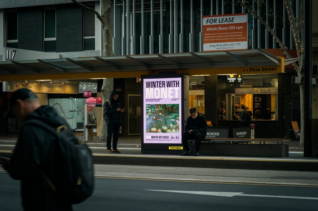
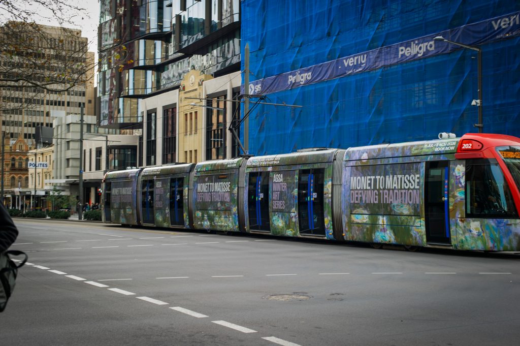
Format: Adelaide Trams – Full Wrap & Digital Portraits
The Art Gallery of South Australia is bringing its Winter Art Series to life across the Adelaide Trams network, with a vibrant mix of Digital Portraits at tram stops and a high-impact Full Wrap across the vehicle. The Full Wrap features a beautiful Monet-inspired artwork, giving Adelaideans a taste of what to experience at the exhibition. Complementing the Full Wrap, the Digital Portraits showcase a diverse range of featured artists and artworks, inspiring commuters to discover the talent and experiences on offer throughout the Winter Art Series.
Why we love it: The campaign’s creative approach is simple yet striking, combining minimal, easy-to-read messaging with bold, vibrant colours and visually appealing artwork, bringing the exhibition to life on the streets of Adelaide.
Ubank
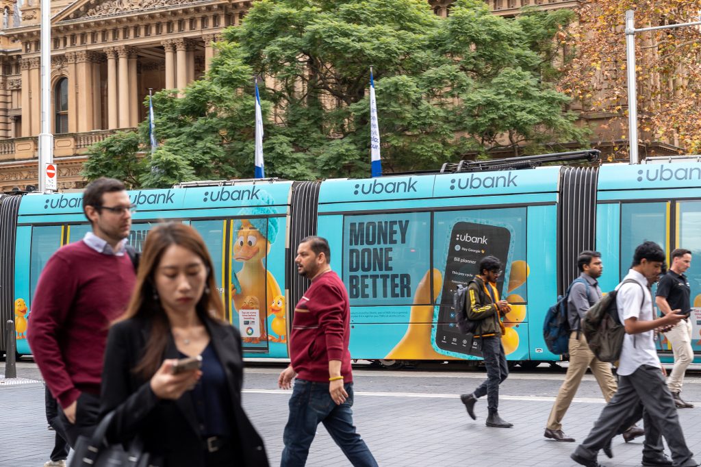
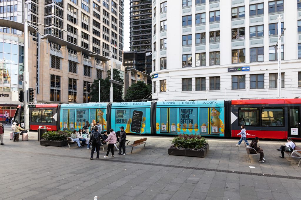
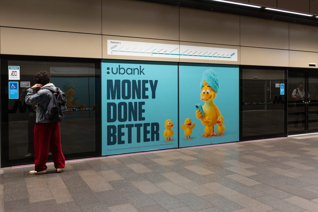
Format: Sydney Light Rail – Triple Carriage Wrap & Sydney Metro – Showcases
Ubank’s ‘Money Done Better’ campaign is brought to life through its playful rubber duck characters, creating an eye-catching and humorous creative that is designed to target young adults. The campaign aims to simplify money management, helping Australians feel more confident about getting their money in order. The creative cleverly features a Mother Duck getting her ducks in a row, providing a humorous and memorable visual for Ubank.
Why we love it: The playful animal character adds personality to the campaign, and the bright, simple creative is perfectly suited to the transit environment, ensuring it captures commuters’ attention while they’re on the move.
GPT Macquarie Centre
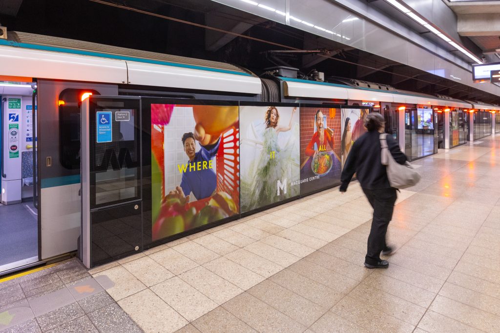
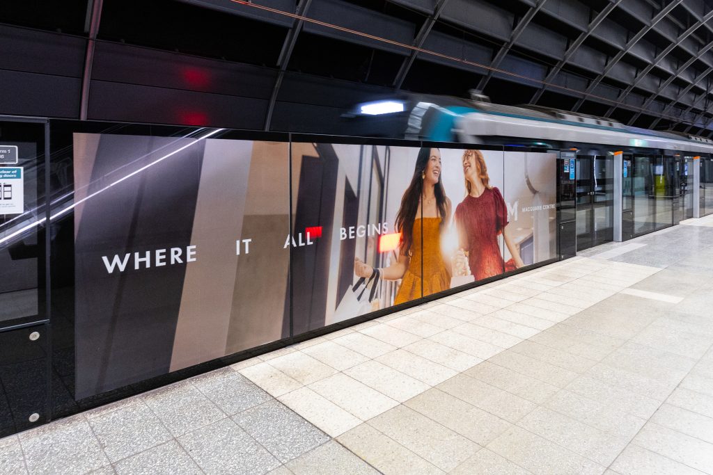
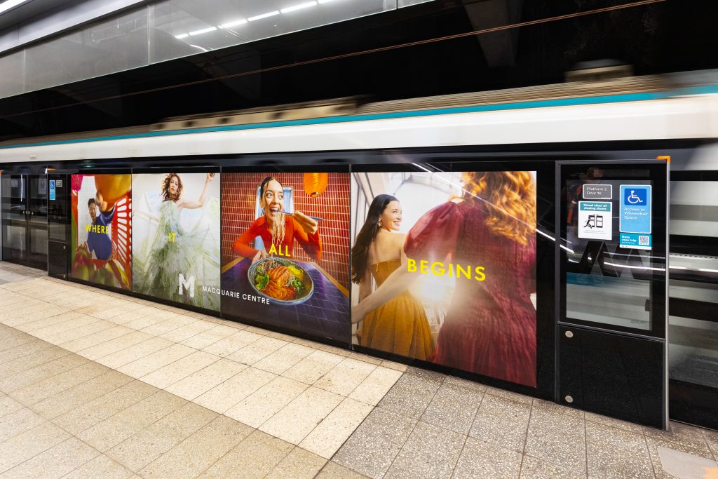
Formats: Sydney Metro – Showcases
Macquarie Centre is targeting commuters at Macquarie Park and Macquarie University Metro Stations with shopping inspired Showcases to reach commuters in proximity to the shopping centre. Making the most of the individual panels which make up a showcase, the campaign features a different creative across each panel, creating a visually engaging campaign. The creative demonstrates the diverse shopping, dining and lifestyle experiences available at Macquarie Centre.
Why we love it: The campaign’s vibrant creative execution creates a bold presence within the busy transit environment. This is particularly effective across Sydney Metro stations, where the naturally low-light environment allows the bright colours to stand out and capture commuters’ attention.
Check out more of these great campaigns below and on our socials!

Recent Comments